
Hello,
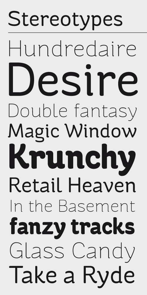
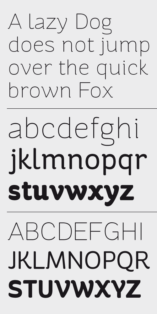
in my last two weeks i was working on a new informal sans-serif typeface.
here are two pics of my work right now.
critique is welcome.
thank you.
Hello,
in my last two weeks i was working on a new informal sans-serif typeface.
here are two pics of my work right now.
critique is welcome.
thank you.

I like the relaxed feeling.
Some notes:
* the "a" counter seems a bit too small (I would make it more lite that of the "e", in area if not in shape)
* "C" and "G" seems top-heavy/unbalanced
* "g"'s "tail" don't seems to work properly
* "Q"'s tail could be better
yes ... my professor told me the same with the "a" counter. i will open it a little bit more.
the complete uppercase was made the last two days and there are still some little things i have to fix.
"g"'s tail ... oh yes, the open end is not quite good, maybe i'll draw it again from scratch
thanks
Captured from web.archive.org on 19 Apr 2015. view this capture