Typophile

Newspaper Nameplate WIP

bybrettjohnson

I'm working on a redesign of the newspaper I work for. I'd love some honest feedback and ideas.

Also, I'm planning on using Utopia for the body type (also used in the nameplate) and Franklin Gothic for headlines and other things. Are these choices too cliche for Newspaper? Any other suggestions?

Old:
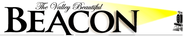

New:

Regarding the nameplate, it seems to me that "The Valley Beautiful" don't connect well with "Beacon": italic and roman are clashing a bit and there isn't any apparent alignment.
I don't know if Utopia is too cliché, but I would avoid using the same typeface for nameplate and body text.

I think your version is a lot less outspoken than the old one (and therefore less recognizable)
Maybe try to customize the letters a bit.
I also agree with Riccard0 about "The Valley Beautiful".
Because it's all caps the top (cap height) is a straight line, a possibility might be to put "The Valley Beautiful" along it.

i don't have Utopia and didn't take any time to make it look good but this is what i (more or less) mean:

[Marvin]

The nameplate above would be right-aligned. (I realize you couldn't have know that.)

What the problem with using the same typeface though? Doesn't the Times do this? I don't want to stray too far from the old nameplate (keep the serifs).

I feel there is a little disconnect also, but I'm partial to the italics.

I tried a couple of versions with "The Valley Beautiful" on top, but I'm hesitant to make it look so traditional. I realize that is a risk though.

All input is welcome. I've never designed a nameplate before, and I'm quickly realizing it's a bit different from a typical logo.

Thanks.

Ah, I automatically presumed that it would be center aligned
With customizing I meant just a little bit like the A in the original
Maybe (and this is a huge guess) you could align the ends of the words “The Valley Beautiful” in the same slanted way as the italic itself goes and make the left vertical of the B follow that same line

Again a very ugly example:

[Marvin]

I threw a more traditional setup together:

What do you think? It would be centered.

I think customizing the type is good idea. I'll see if I can come up with anything.

I think you should keep the B the same size as EACON. Then center it.

Hi Brett,

I've always felt using the same font for a header or logo as for the body copy lessens the impact of the masthead or logo by reducing the contrast between the two, giving a homogenous, plain look.

I realise it is early stages, but have you tried mocking up an entire page with the masthead in place?

Nice job, good luck!

Captured from web.archive.org on 8 Nov 2013. view this capture