
Yo guys, lets take a minute to talk about why this is the best font evar.
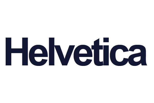
This thread ran to 2 pages of replies and only one was recovered, so replies are missing.
Yo guys, lets take a minute to talk about why this is the best font evar.

That is not Helvetica, but Arial.

:-)

Best?
no, it's definitely helvetica

This also is Helvetica:


Pikachu.
@riccard0
you can tell that's not helvetica because of the little dongles on the ends of the letters

Troll?


;-)

He's not called space cadet for nothing.
Nick Cooke

Spacecadetjoe is right. It is Helvetica.
It’s the same as writing the word red with a black pen.
Spacecadetjoe used Arial to type the name Helvetica.
Pieter

That makes it "Helvetica"
-=®=-

No thanks, I saw the movie.
ChrisL

Just wait for the musical, Chris!
Sure, Steve, I hear Massimo belts out a mean version of "Mr SansMan" :-)
ChrisL
What about Tutti Frutiger?
No, that didn't make his playlist, he only sings six songs and thinks that is all the world needs.
ChrisL

[post deleted]

Those are dongles? I've been calling them serifs this whole time.
Those are dongles? I’ve been calling them serifs this whole time.
It's true, as they say, that one never cease to learn! :-)

I will never use it - but - I love Helvetica!

This is my favorite Helvetica.

You can tell it's Helvetica because the little dongles are at the beginning of the letters.
::rimshot::
i find dongles distracting, that's why i liek helvetica. no dongles.
anybody got any other good dongleless fonts?
anybody got any other good dongleless fonts?
Spacecadetjoe, to be taken seriously on this forum you really have to use more proper terminology.
It's sans dongle.
anybody got any other good dongleless fonts?
"Help control the font population. Have your font spayed or neutered."
-Bob Barker
You get a ::rimshot:: from me, Chris and I will even give you Philly in the World series :-)
ChrisL
eliason, this is america, I don't speak spanish,

This is not America. This is the WorldWideWeb.

You beat me to it, Jan.
Don (From Canada)
And sans dongle isn't particularly Spanish, either.
for some extra clearity in this topic, these are USB Serifs:

Btw, I get the feeling mr spacecadet is pulling our leg here...
And sans dongle isn’t particularly Spanish, either.
Not spanish, but in some parts of America it’s italian.
yo guys, forget about helvetica, that's old news.
i was doin a english paper and i wanted to put some typography on it so i started looking at all the fonts in word and i found this one

now thats font, with the subtle, understated dongles

Now typography is something you "put on" something. Like a condiment.
Papyrus is great. I'm assuming you're designing a yoga magazine? Or creating an email signature for your aunt?
That's not Papyrus, this is Papyrus:

nah seventy7, i told u, english paper

This is the most hilarious, useless thread evar. Now I am going to go watch Papyrus. Have you seen it, yet?
yo leverette, i thought this was a community based on mutual respect and love of typography
this has been a rich and rewarding dicussion and it will continue to be one. this bad boy is going straight to over 9000 coments
My apologies, I seem to have left out the properly trenchant smiley. :n) What a dongleface I can be sometimes.
Oh, dagnabbit, there I go sticking my serif in my mouth again. :P

Can you spot the difference between these two images? Hint: they both have dongles.

two whole days at number one, why are type nerds so trollable?

Because we take ourselves so seriously that it's easy to take trolling as an opportunity to laugh at ourselves, the troll, and to geek out a little. No trouble here, spacetrolljoe.
Dongles. Good times.

The left image is also a rude comment in French. ('this is not a BJ)
I'm almost sure René Magritte's intentions were pure, but thanks for the lesson in French vernacular. Jack Summerford probably wasn't alluding to anything rude either, but I can't be positive.

Depends on whether you think ITC Garamond is rude. ;-)
"whether you think ITC Garamond is rude"
LOL!!!
The funny thing is that it was the hottest font on earth back in the late 80s. It was the standard bearer of the "X-height über ales" crowd of the time!
ChrisL

X-height over ales? Or x-height über alles?
›Helvetica‹ set in ITC Garamond reminds me of bad American ale.

This is not Comic Sans.
This is not dada.
Confounding trolls is what type nerds love to do ;-)
http://slowprint.com/ Letterpress for Typographers!
http://alphabets.com/
By the way, the thread title is missing the required early 21st C emphatic punctuation:
Best. Font. Ever.
And no, neither Helvetica nor Arial are the ....
(for one thing, Arial is a 'font' but Helvetica is not.)
http://slowprint.com/ Letterpress for Typographers!
http://alphabets.com/
Captured from web.archive.org on 25 Oct 2014. view this capture