
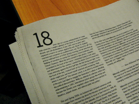
What is the accepted etiquette regarding a drop cap if the text opens with a numeral?
I'm not sure if I've seen it in print or wether I've just ignored it but it looks pretty awkward on screen here.
What is the accepted etiquette regarding a drop cap if the text opens with a numeral?
I'm not sure if I've seen it in print or wether I've just ignored it but it looks pretty awkward on screen here.

Spelling out the number would be an option.
Another one would be rephrasing.
Third one: Don't!
Opted for the rephrase in the end, didn't much fancy searching the rest of the document to change all the other 2010s, reflow hell.
You could have changed it to "AD 2010" for that one instance. :)

Except that AD with the A as a drop is almost as bad as just the number. (This doesn't apply to a year, I think, but most style books say that if a number starts a sentence, it should be spelled out, as fFntgrube suggested.)

What if a chapter starts with a long poem, and rewrite is not an option?
Shold one:
A. Drop cap the first instance of prose text. (might fall on the next page, or even further down the queue)
B. Abandon drop caps in that chapter.
C. Attempt to drop cap the first line of the poem (might look mighty weird.)
So far, I am leaning towards B
_____________________________________________
Personal Art and Design Portal of Ivan Gulkov
www.ivangdesign.com

I don't see anything wrong with a numeral drop cap (or drop lining) ;)
This is more of a raised cap
Imagine a paragraph beginning: 27,546 customers replied to our survey [...]
:-) Andreas

Not starting a proper sentence with a number is another part of good writing...
Not everyone can afford to only typeset good writing ..,-)
's Fair. I would settle for typesetting only properly spell checked text -- can't get that either!
It could be "27" dropped or raised followed by "thousand and 546 customers..." or even "27," followed by "546 customers..."
The main reason for drop caps in commercial and editorial applications is to grab attention. It is even more attention grabbing when there are numbers involved so I don't see why they should be treated as an exception.
Another great one would be a drop cap question mark in Spanish or a drop cap # in a text dealing with html or coding.
Captured from web.archive.org on 12 Mar 2015. view this capture