
I'm primarily looking for feedback on name legibility at this point. Being that the type is hand drawn, and the word is uncommon, I'm worried about the viewer's ability to pick up the name. Any feedback would be appreciated.
Cheers,
Jim
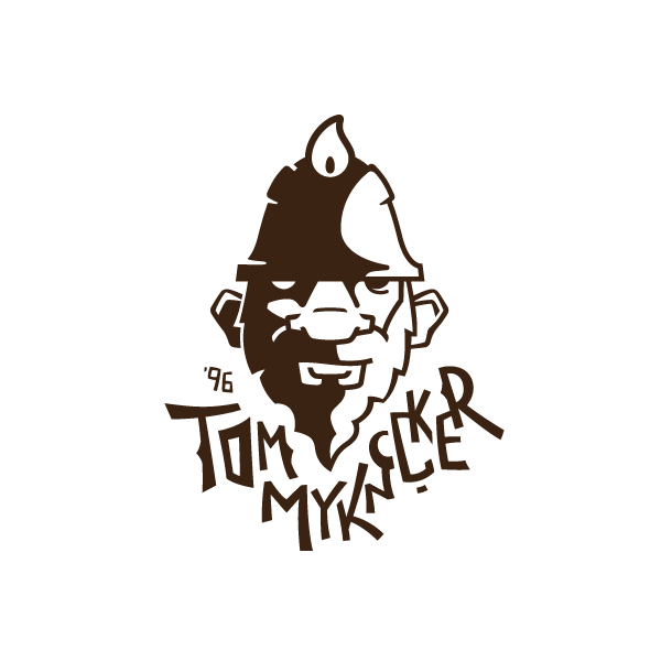
I'm primarily looking for feedback on name legibility at this point. Being that the type is hand drawn, and the word is uncommon, I'm worried about the viewer's ability to pick up the name. Any feedback would be appreciated.
Cheers,
Jim

If I'm being quick about reading it I get lost after the first K.

This looks fun, but I too get lost between the k and ker. Also, you can do more of that thorny thing on some other letters.
What's the explanation behind the troll symbol? And is that a flame on his head?
Yes, it's a candle flame. The symbol is based on a Welsh legend - it's a tiny miner that would haunt/protect gold mines.

If it needs to read Tommyknocker I would suggest keeping the Tommy as if one word and making the second O show enough to not be confused with a C. The way it looks now I read Tom as a separate work and then I see MYNKC in a row.

Read it as Tom Myknclker

Tom MykncCker.
It's cool, but illegible. Have you tried using color to separate the Tommy from Knocker? That might be enough - if people read "Tommy" clearly, then "Knocker" might be more evident.
Maybe?

Is it really supposed to say Tommy Knocker? Damn that's bad. It looks fun though, but I would probably put the "Tommy" part all on the left side without the first M at the top, but instead lower, so that it would say "Tommy" diagonally. If done right, it will bring the Y more to the left so you have more room for "Knocker" so you won't have to do that horror with the "noc" part. Don't make "no" into one letter/symbol, don't cut the "o" in half, and don't make the "c" so big. That being said, I do need to compliment you on the style of the letters and the illustration. Nice work there.
Captured from web.archive.org on 18 Oct 2013. view this capture