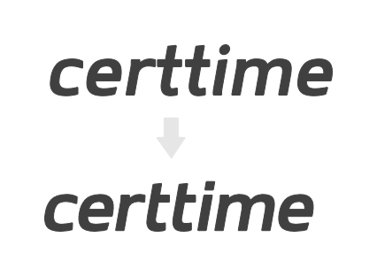
The brief is as follows - an online digital time stamping service geared towards the design professionals. It needs to evoke feelings of trust, reliability and maturity while still being approachable, friendly and modern.
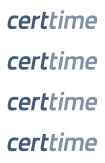
This is an early iteration, and I have converged to the following set of typefaces:
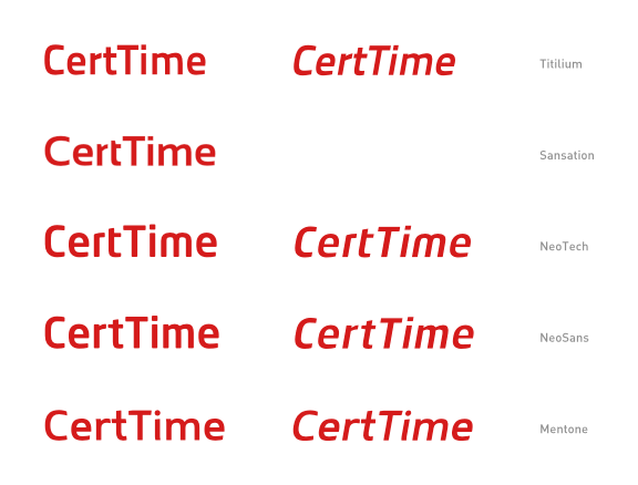
My top choice by a very slim margin is Titilium italic. I also really like the r-t pairing in Sansation, specifically the shape of the 't', and I am considering building it into the Titilium version.
Alternatively, I am looking at using NeoTech italic, but borrowing 'r' from NeoSans.
Thoughts ?