Typophile

Geometric yet Friendly Sans-Serif

Matt V

Hey everyone,

I'm tweaking a logo for a church and looking for the perfect sans-serif. Ideally it would be something pretty geometric -- I'm looking for a round "O" to complement the mark. Also, I would prefer something with a single-story lowercase "a." Right now I'm actually considering using Futura. It's definitely geometric, but it doesn't come off as very warm or personable.

Thanks for your help!
Matt

What application are you using to create the logo? Something that supports the various sorts of OpenType alternates, like Illustrator, InDesign or QuarkXPress 7+?

T

Thomas,

Thanks for the reply. I'm designing in Illustrator. I'd still love to hear your suggestions, but I think might have solved my own dilemma with Avenir. I decided that single-story "a" in Futura was actually hurting the friendlieness-factor. :)

Matt

Hi,

Here's some geometric fonts I like, and are a bit more friendly than futura:

Agenda
ITC Johnston
Corinthian

Hope this helps

Jeffrey
infraordinaire

I’ve been working on a very similar project, where a friendly geometric sans with a circular o was needed. Depending on what letters you need, I might have something for you. I’ll have to draw up an a.

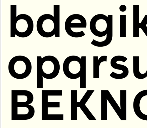
Here’s a few letters:

Houschka Pro

Nick Cooke

Nick, your work is amazing!

No single storey a, but very friendly: Museo Sans.

Darn. All these pro’s just overshadow my work :)

Pro?... I won't mention the # of hours I worked on it :)

Bryant has an alternate a as a stylistic set. There's also the an alternate spurless variant.

Frode, you are too modest – your work, from what I have seen, is really good and always getting better.

Yes Frode, yours looks pretty promising - I like it, and thanks.

And Jos - your Museo 500 is very good and a damn sight cheaper than mine!

Nick Cooke

I agree with the others, Frode, nice work.

Nick, thanks a lot! And cheaper indeed... especially the 500 weight :)

Thank you for the kind words!

Wow. You guys have overwhelmed me with your responses. To see the names Nick Cooke and Jos Buivenga in the replies is incredible - I'm familiar with your work and have high regard for both of you. Although, I must admit I wasn't aware Museo had a complementing sans-serif! I'll definitely keep that in mind for future projects. And Frode, thank you for your generous reply. Your willingness to open up a custom type to me is really, really kind. It looks spectacular.

I almost feel like I'm letting you guys down… our team just came together behind Avenir today. I really appreciate the input, though!

Thanks,
Matt

What about Apertura?

from the description: "Apertura is a rounded geometric sans serif referencing the geometrics of the mid 20th century but with a humanistic twist."

Rahim

I'll get over it :^)

Avenir is a good choice.

Nick Cooke

I'll get over it too... with all that kind flattering that shouldn't be too hard :)

i'm know i'm late to this party, but frode as i've said in other places, this face of yours is really nice, i can't wait to see it finished!

nick and jos - both very nice work and giving me more options to think about as well!

All of mine. Ah, I forgot: beware, self-serving plug right here!!!

Avenir is a good choice. Thanks, Simon!

I recommend our very own Mark Simonson's Proxima Nova. Deelish!

Our very own what?

Gee whiz, James. He just means I'm a fellow Typophiler. (Thanks for the plug, Owen.)

Hey Frank, I’m loving that friendly sans you are working on. Be great to see where it finishes.

Chris

Captured from web.archive.org on 21 Feb 2015. view this capture