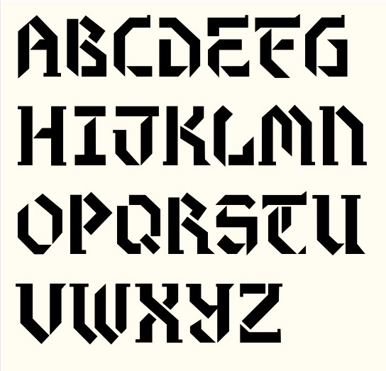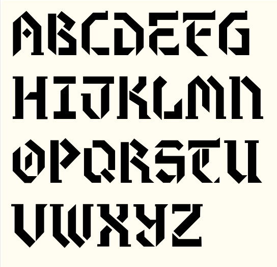
OK... don't hold back. This is still very much in the conceptual stage. I want to get feedback and assistance before I do the fine tuning.
I also have a few questions.
1. How is the ratio of height/width?
2. What degree of angle should I use for all the diagonals? Does it look weird to mix it up a little?
3. Do the ambicase styles of "N" and "Y" work?
4. Should I slightly angle vertical and horizontal lines to compensate for optical distortions?
Thanks for taking a look!
_eric
** EDITED Oct.19.2009: changed title from "Blackletter Stencil" **