Typophile

Fonts for my online portfolio

Yaronimus-Maximus

hello typeoholics.

i'm designing my online portfolio in my domain "yaronimus.com".
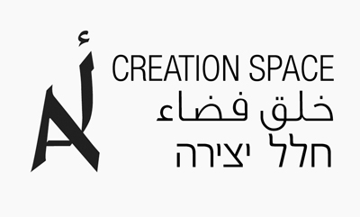

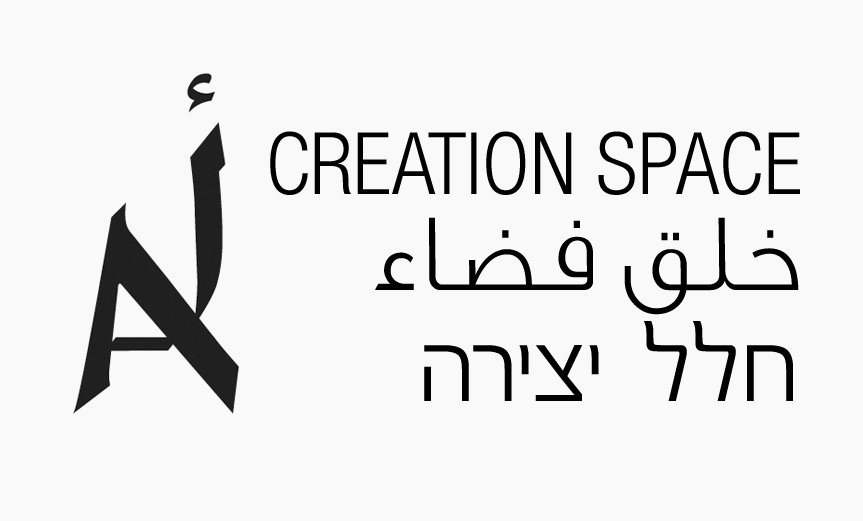
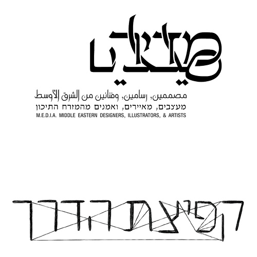
i named the site itself as "creation space A"
above is the sketch for the logotype, which containing the first letter of three languages - hebrew Aleph, arabic Aliph, and english A). this will appear at the site entrance page. (the fonts here are just for presentation).

this site will be like the homebase of my virtual presence, containing displays of art and design, but also a good place for experimental and creative process publications, and links to my other online resources like flickr, facebook, mail, behance, etc etc.
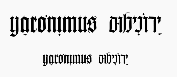

this is my logo at the moment (which will also appeare in the site).

my site will show works by projects in a format which will be a mixture
of a blog and a magazine.

i'm looking for a font good sans-serif font for headings, which is clean and legible in smaller sizes (like jpg buttons in a website), but also has some nuance (lyric) calligraphic qualities. in a way, this font needs to bridge between minimalism and my works which are often characterised by calligraphy or typography.

the closest matches i found were italic/slanted solutions like linotype's optima nova (which is very expensive btw).

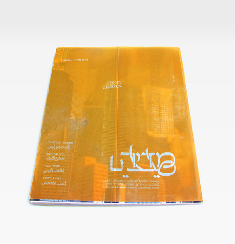
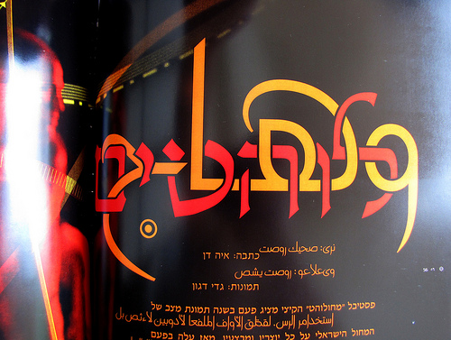
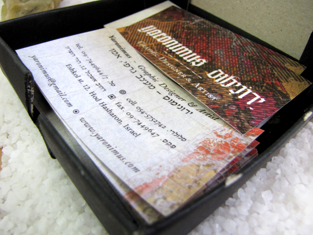
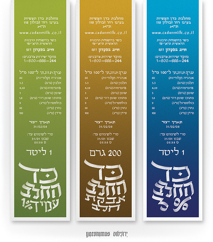
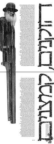
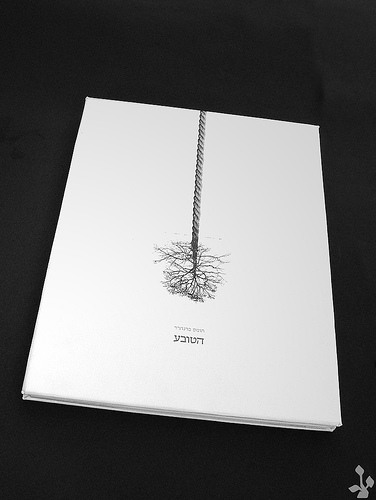
just for example, i want to show some works to illustrate what i was saying:

If you like Optima Nova, Beorcana is always a gorgeous alternative.

And a few more suggestions, near the calligraphic serif genre: Brioso Pro, Incognito, ITC Stone Serif, and Eason.

From a completely aesthetic point of view, the final image on the second post is absolutely beautiful.

I know this contributes nothing, but still!

thanks everybody, and thanks James Deux.

i don't think i have found what i wanted, but it's because i'm not sure.

perhaps i'm looking for clean serif fonts with calligraphic qualities such as changes of width, but not too extreme (nuances of calligraphy). a font which looks good in small sizes. maybe bold-italic.

thanks for helping.

Perpetua italic?

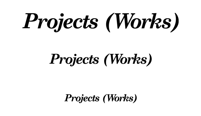
what do you think about this font:

century schoolbook. (i've shortened the letter P because i didn't like it).
i am thinking of using it as a font for the main buttons on my site (jpg in small size).
what is this font making you think?
do you love/hate it?
why?
what is the general social approach to this font?

i might do something with the letter

...

Captured from web.archive.org on 23 Aug 2013. view this capture