
Down to the wire... program cover for the wedding, does the "monogram" work for you guys?
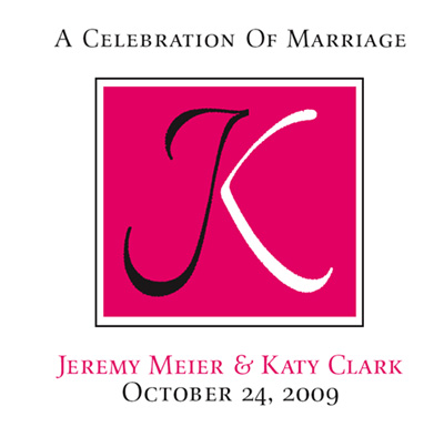
Thanks
Michael
Down to the wire... program cover for the wedding, does the "monogram" work for you guys?
Thanks
Michael
Before you say it... no kerning yet, just concept.
Michael

The calligraphy is lovely, and the concept good. I find the color, at least on my screen, a little too assertive. I think it needs to be calmed down, so the JK is the main thing, not the color.

I like it. I wonder if Katy will, since she has to share half of her letter, and Jeremy gets all of his.
:)

Nice work Michael... the monogram idea is solid, clean and elegant.
However, the first thing I thought with the black "J" for Jeremy and white "K" for Katy was 'interracial marriage' or 'opposites attract'. (take it with a grain of salt as I've had a rough morning taking care of sick kids) Why not just make it all white so it's the coming together of two as one?
Also have to agree that the hot pink is distracting. How does it relate to the wedding? What are the dress colors?
I know this is a concept but have to point out the inconsistent gap on the frame around the monogram, but I trust you'll be fixing that in the final.
Sorry, the Rubine Red is the color! The frame is a victim of the PDF process... I always hate that about PDFs. I could change the border to "pink," but I felt a black box would have been toooooo ominous!
Anything else?
Michael

I quite like it, Michael. My only comment might be to wonder if using a circle rather than a square to frame it might make the union more continuous as well as invoke the feeling of a ring? I don't know if it would look for better or for worse but you might try looking at it.
ChrisL
Good idea Chris... I will try it. Thanks!
Edit: And cute... I almost missed the humour in the first pass :-)
Michael
I like Chris's idea. If you have a circle with your calligraphy encircling it, I'm sure that would be lovely. As it is, something is off about the way the text relates to the square.

Top of J wider. Twine the middle of the K part around the J stem?
Tried it (circle)... toooo much curve involved.
Next
Michael
I tried it "tied" up Carl... I did not like it. That, at least, I can sneak past Katy :-)
I wanted to draw the top out but I kept seeing a T.
Michael

>I wanted to draw the top out but I kept seeing a T.
As in T-Mobile? Hence the color? ;-)
How about rounded corners on the square.... hmmmmmmmmm?
More class than t mobile and it is the bride's choice of colours.
Michael
"it is the bride’s choice of colours" at least it is not the bride's mother :-)
ChrisL

In my opinion, the o in of should be a small cap, not a full cap.
Chris
It has turned into "motherzilla" She wants a Colonial Williamsburg trivet design with the initials... and that's when the fight started.
Still going on, so does anybody have a doghouse I can sleep in, I am tired of mine.
Michael

Love the monogram concept Michael. I have issue with the brush/nib direction between the letterforms, the J looks especially fragile.
I would shrink the letters on the background to let them breathe a little. They look a little jailed at the moment.
Good luck with it
Chris
Michael,
I would rather get a barbed wire enema than do anything involving mother-of-the-bride decision making :-)
ChrisL

smallcap "of"
I agree with everyone about the color being harsh. But moreover, the design is heavy. It's just yelling, "DUDE, WEDDING!" But it's all scale and color. In other words, less contrast in the color.
Otherwise quite lovely.
Mills Chris brings an awesome point to the table about the nib shape. Top right of the J should be heavier. But....nit pick under deadline. :)
Chris
So you've a doghouse I can camp out in :-)
As to the rest:
The color question is moot. As to the execution of the forms... it is classic calligraphic manipulation in an effort to equalize opposing weights (color). Were it heavied up, in black, it would be oppressive (to the right hand side). i.e. the J would be dominant... not what I am trying to achieve.
Michael

Michael
what about scroll nibs, multistroke pens?

I think the monogram and color works just fine. The only thing I would change.... small caps all the way (skip the upper case letters). Now to me the text rhythm jumps up and down.
Cheers

I would make it more evident by using a double downstroke line in the J.
. . .
Bert Vanderveen BNO
When I said 'something is off' about the text, I had a number of guesses, but I'm not sure what is the best solution. One is all small caps, as Stefan suggests. Another is making the names and 'a celebration of marriage' align right and left, and put the date somewhere else. Another is making the JK smaller relative to the frame, as suggested above. (You can do all, of course) Another is you doing all the text in your calligraphy, etc.
The basic JK is fabulous, and something the couple will treasure for years.
Michael,
I think it is time for you to just finish it on your own. It seems to me that you can now just be the judge of one.
ChrisL
Captured from web.archive.org on 9 Aug 2014. view this capture