Typophile

Palatino...but not?

ekdig

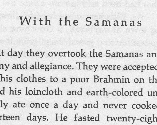
Help identifying this one? I thought, based on the odd capital "S" and the outward facing front feet on letters like lower-case n's and m's this was Palatino...but the lowercase y is totally different. Eek! Help? Maybe it is really obvious, and I'm just being thick...
Thank you!

Palatino's designer is Hermann Zapf, and he designed a few similar fonts, like Aldus, and Zapf Rennaissance (I think Sistina and Michelangelo are all caps). I don't think this is one of those, but I haven't looked yet to confirm that. What I suspect is that someone 'customized' Palatino by borrowing a 'y' from another font to change the look.

- Mike Yanega

Huh. Crazy. That could be possible. The y is really distinct (to me - I'm no expert). Have you seen it before? Now that I'm looking at it, the brackets on the v are different, too. Maybe it is another Zaph font, as you suggest. That S is so crazy (the lower counter, if that is the right term...)

This is Siddhartha by Hermann Hesse, right? when the book (edition) was published?

I looked at the other Zapf fonts, and I don't think that 'y' is from any of them. The rest of your sample looks like Palatino, although my review of that was only quick.

Sometimes when a supplier want to offer an alternative version (to use a euphemism for copying a design), they will create a 'new' font by changing a couple of letters, so it's not a complete copy. Old time metal type foundries did the same thing all the time. Mergenthaler Linotype, American Type Founders (ATF) and Monotype were constantly copying each other (or other foundries) so they could offer a similar style to their own customers.

- Mike Yanega

The lowercase w is not Palatino either, but I'd agree apart from these three odd letters the rest looks very much like Palatino.

Mike,

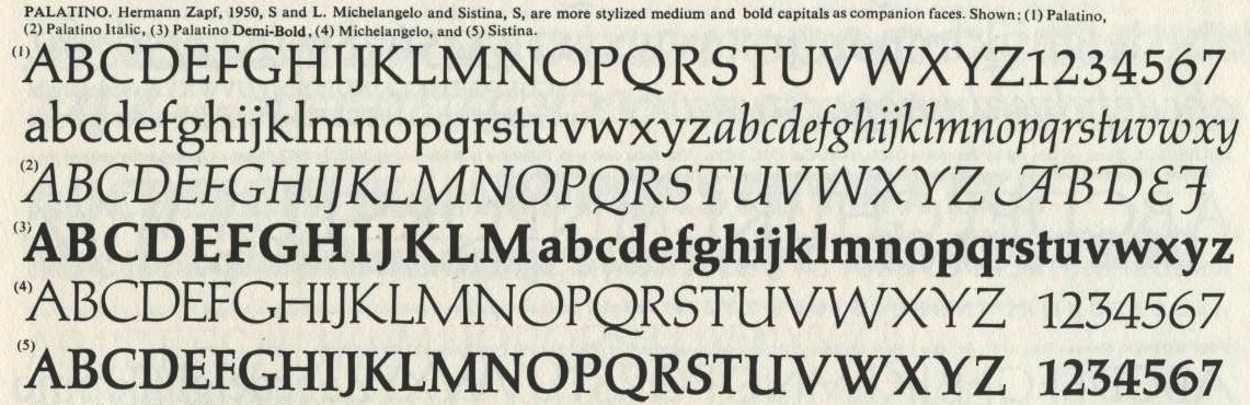
See The Type Specimen Book p.392 -- Palatino Semi-Bold; Phil's -- p. 286/7

David, I'm not at home, so I don't have my books, but I presume from your comment that we are looking at a pre-digital Palatino? I know Mark Simonson pointed out that it was different from the digital versions.

- Mike Yanega

Hey guys,

Thanks for all the help with this.
Yes - it is from Herman Hesse's Siddhartha.

The edition is from a New Direction's Paperback, copyright 1951.

"...they will create a ’new’ font by changing a couple of letters, so it’s not a complete copy."

That is really interesting. I had no idea!

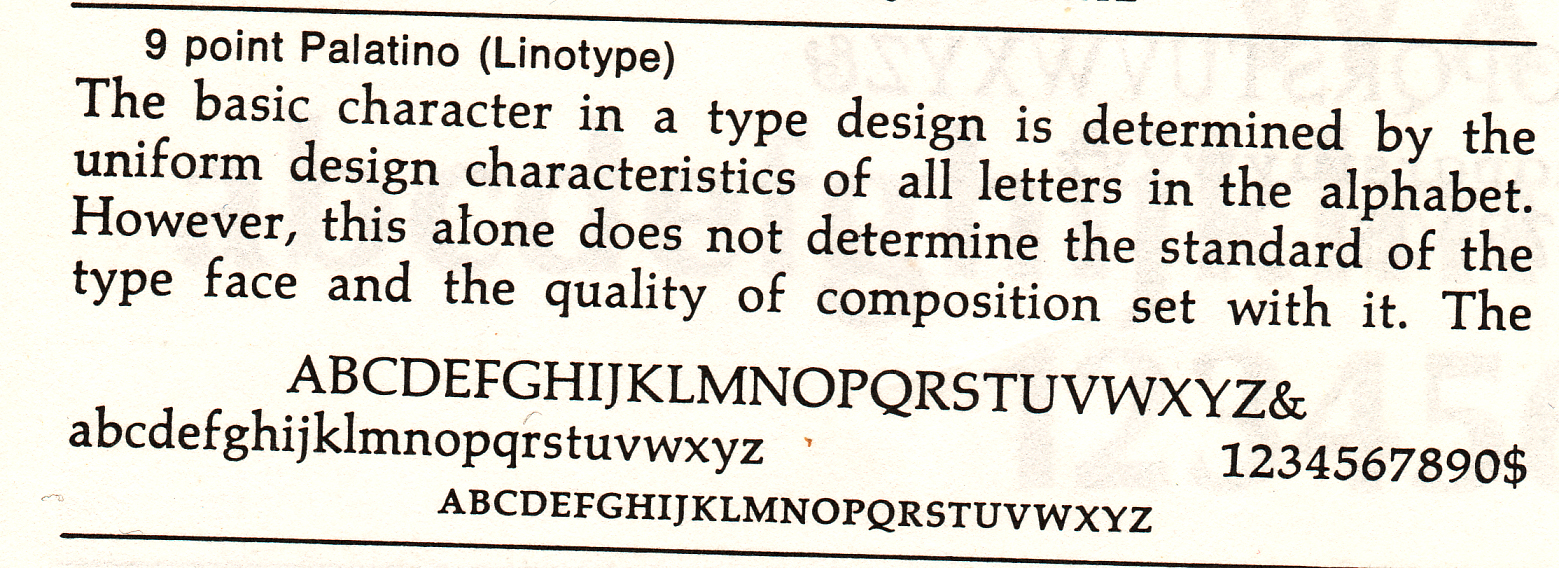
The sample of Palatino in the back of "Type and Typefaces" by Ben Lieberman matches the setting in question very closely. Unfortunately, it doesn't list the source for the sample:

> Unfortunately, it doesn’t list the source for the sample:

Linotype:

It seems this is the original version of Palatino. There was also a modified version released in the 1950s. According to Zapf in his book "About Alphabets":

The somewhat calligraphically-stressed letters E F S q p s v w and y in the Palatino roman were given more traditional forms for the British and American markets....

I think the modified Palatino is the version one usually sees and the only one that has been digitized.

Glad you were about Mark. That should close this one out.

- Mike Yanega

Indeed.
Thanks, guys!

Interesting. Looks like these last two are slightly different cuts too...look at Q, p and q.

Judging from the link Riccard0 provided (and David's example), it seems that my book is set in the original Linotype version (my p's and q's have serifs).

I'm sad they did away with the original y, v, and w. I think they add interest to the typeface. I rather like them.

Nice Palatino link...I knew there were quite a number of different cuts but that's pretty definitive.

>I’m sad they did away with the original y, v, and w. I think they add interest to the typeface. I rather like them.

Me too. (Perhaps only because they're unfamilar though.)

Captured from web.archive.org on 21 Aug 2013. view this capture