
Hello,
Okay, what do you think?
thanks
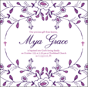
Hello,
Okay, what do you think?
thanks

I would spell our Florida.

The M-y connection looks wrong. i would edit it to come up from underneath and join at an angle, not a rounded curve. then the letters could be moved a smidge closer. What do you think?

To my eyes, the type for Mya and Grace don't sits very well with the floral decoration. An upright script, maybe? Or a more decorated one?
Hello,
thanks!
In general do we like this?
Also does the secondary typeface work?
What kind of script would work any suggestions? I like this one (Edwardian) but am also not sure if it goes with the illustration.
I agree about the Florida good suggestion.
In general, I like it.
Given the small sample, I think the secondary typeface works.
Unfortunately, I'm not a script expert, but given the drawing, I would look for a low contrast script, if not monoline. In order to match the strokes of the type to those of the decoration.
riccard0
thanks! Good idea I see what you mean by a monoline that would be better and would be a good font to own since most of my illustrations are in this style.
Anyone have a suggestion for a nice, not terribly expensive monoline script? I need a very pretty one...I have Coquette, I don't like handsome...I need something that is very special and goes with my illustration style.

> What kind of script would work any suggestions?
I'll go with Susa (light) by Hubert Jocham!


I also think the other text looks a touch crowded. Maybe making the name a bit smaller would open some breathing room.
David,
Not bad, I like this one and I can afford it. thank you.
Any other suggestions? Most of my clients like a very sophisticated/elegant typeface (royal) like Edwardian script OR Mrs Eaves so I need to find a balance between my illustration style and what they want out of a typeface...any other suggestions? I like this, but I worry that they will feel it is too child-like. I need something that feel adult and rich.
Blanchard by Canada Type;

Hmm I know you are trying to help me, and I really appreciate it...
..but I think i really need something with all the swashes and swoops of Edwardian script, but maybe just no thick and thins? Is there a monoline or almost monoline font that is otherwise fancy? It needs to feel sort of 1800s and/or victorian like the illustration does... ornate and decorative and feminine...like a sketch for a victorian illustration.
If I didn't think I would have to use it over and over I might just edit the Edwardian to be a monoline, but that is not practical for many pieces over time.
Okay, my last tries:
Monsieur La Doulaise (though the M-y is not great)
eliason,
thanks! I think Young Baroque could really work! I might have to edit away a few of the swirls on the caps because they are over the top, but the way the letters are drawn and connect feels like my drawings and not at all childish...more just fresh and yet formal... I like the way there is a loop where the lowercase letters connect. thanks for all your help!
You're welcome.

Maryam looks feminine, elegant yet unpretentious, and with a touch of naiveté, like your drawings. This version is a combination of Maryam Regular and Alternate.

How about Nelly Script? This was a Rising Star of last month on MyFonts.

dinazina, nice!
Well everyone what do you think? I think this might just be "the one" the soul mate to my illustration style....what do the rest of you think?

dinazina,
that is the best and nicest description of my drawings I have ever heard...I am working on my website now, would it be okay to quote you on that?
thanks!
That is a very nice fit.
eliason,
thanks! Good work team! : )
off to buy the font now....
Man what would we do without this great website?
>>would it be okay to quote you on that?<<
Sure.

This is a perfect example of where Nelly Script shines, I think. I would promote my own fifties script, but only for the heck of it ;)

Rob,
Great! Thanks for the validation.
Yours is very nice...the only reason I prefer Nelly is because it feel LESS fifties and I need something that does not have a specific time period attached to it, but rather just the flavor of vintage.
I think the flowers are too dark as they complete with the message, but maybe its just me.
Captured from web.archive.org on 1 Feb 2010. view this capture