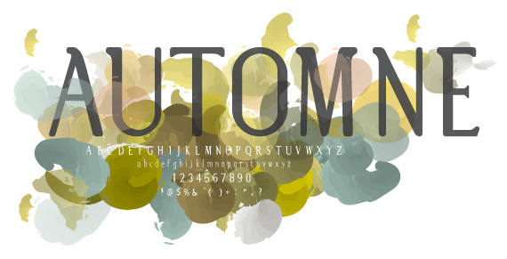
Started more than 2 years ago, not yet kerned, unbelievable!
The main inspiration was a typeface that emphasizes the Golden Section Page Rule, and the Alphabetum Romanum, I took some of the qualities displayed by Rotis Semi Serif, and Calibri.
I'd really like to continue on this project, but it seems to have many structural flaws, which means lots of reworking to do, and that kinda turns me off..
Is it worth continuing? do you have any idea to improve this typeface..???
My current hypothesis is this type has waaay to thin stem on it's lowercase and the serifs are fat and inelegant
Thanks in advance
| Attachment | Size |
|---|---|
| Automne-Title.jpg | 88.41 KB |
| Automne1.pdf | 23.93 KB |
| Automne2.pdf | 119.52 KB |