
hello
just bought typetool and here is my first attempt at drawing some letters in it.
bit concerned about the lowercase wieght, x-height and curves- any hints before i move forward?
cheers
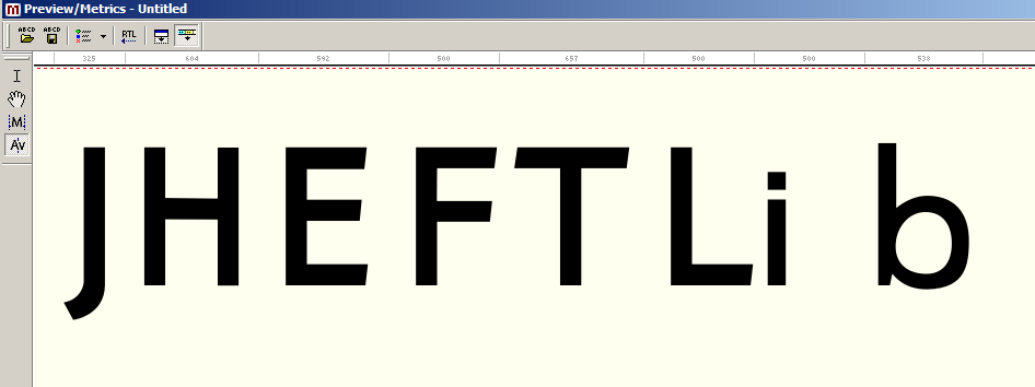
hello
just bought typetool and here is my first attempt at drawing some letters in it.
bit concerned about the lowercase wieght, x-height and curves- any hints before i move forward?
cheers

The lowercase might be a little too light compared to the upper. It's hard to say with so few characters.
The "b" definitely needs some work. The right side seems to flatten out a bit (I think it should be more round). The bottom right corner looks a little too thick. And the stem on the left is too narrow. It also looks like your overshoot below the baseline might be a little much.
And I'd probably shorten the lower horizontal bar on the "F" a bit
Keep working on it and post another version once you've got more characters done.
thanks jonathan :)
some more caps. im leaving the lowercase alone for a bit
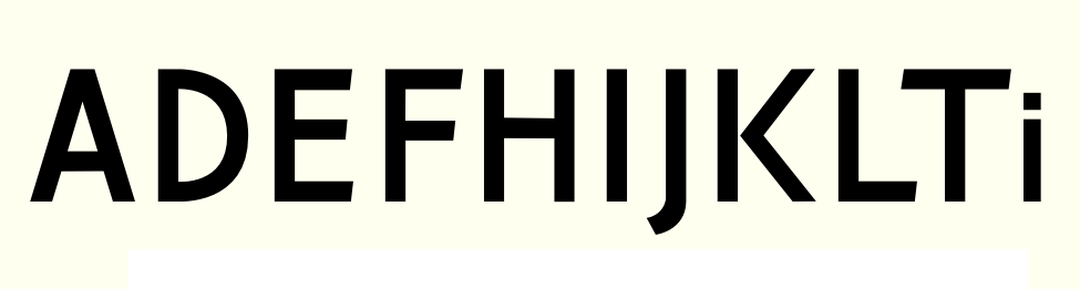
is this 'O' biting futura too hard?

there are probably not enough characters to judge - you should start with /a/, /n/, /o/ and, as you already did, /b/ or /d/. lowercase characters are bette suitable to define the character of the typeface...
your /b/ is too egg-shaped (compare the left part (where the bowl comes out of the stem) to the lower right part)
the weight of the uppercase characters is unbalanced (/A/ too heavy compared to /D/ or /K/; heavy joins of stems at /A/ and /N/) your /O/ is too light on its left and right side. the vertical strokes should be thinner than the vertical ones, because of its optical weight.
what works really great when designing your first typeface is a lot of drawing, erasing and trying again... with pen and paper, not on the screen
Here are a few more suggestions:
• Generally, you'll want your vertical strokes to be a little thicker than the horizontals. This applies to curved characters like the D and O, too.
• Diagonal strokes will need to be a little thicker so they look the same weight as other strokes. Doing this will help the K match the other characters. Try moving the bottom leg of the K a little to the right so it extends beyond the top arm.
you might want to check out Karen Cheng's book "Designing Type." I think it's a really good reference for these kind of rules
• The crossbar on the H might be a bit too high?
• The curve on the top of the D doesn't quite go with the bottom. You might want to try making the D a bt wider, too.
thanks guys- ill post some more soon

Mark Jamra's piece from TypeCulture is also helpful for guidelines like that.
Captured from web.archive.org on 14 Apr 2015. view this capture