
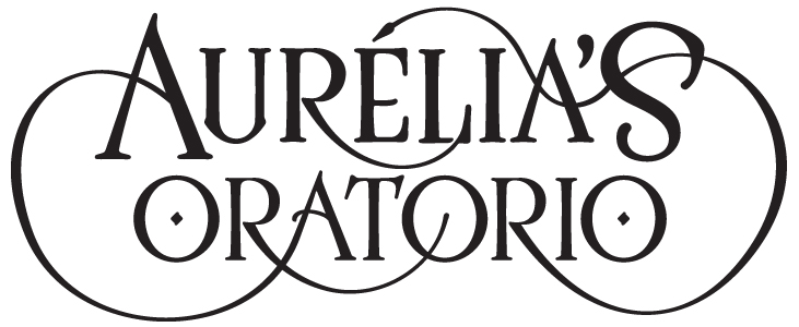
Hi all -- hoping for a critique on this logo for an upcoming play. I don't have a lot of experience creating swashes, but I really felt that was the right way to go with this logo, because it's a whimsical family-oriented show that will play around the holiday season (though there's no holiday element to the show).
The first attached image is simply the logo above; the second shows the logo in use.
A note: I'm not interested in any critiques on the choice of typeface that I started from (LHF Ross). The show itself has a late-19th/early-20th century vibe, so I'm pretty comfortable with the type choice there. I would, however, like critique on any or all of the following questions:
1. At first I was going for more circular curves on the large outer loops, but they were really too large, so I went for the curves they are now to kind of pick up the trapezoidal shape of the logo in general. Are the curves too extreme? Also, is it a problem if they're not mirrored exactly left to right? (Where the curves originate and end don't match, so it seems impossible for them to be mirrors, but I'm wondering if it's a problem to be so similar and yet not exact.)
2. I know there are a couple of problem spots where one of the tails loops through and creates the top second A crossbar. If anyone has any comments about those spots I'd be happy to hear them. Even better, if you have an idea where you think the points should be to create more fluid curves in those spots, I'd love it if you'd take the jpg, circle those spots, and reupload it. I've had a devil of a time picking where the points should be in that section.
3. I know it's not really an accurate use of a swash, but I love the top R tail's creating the end of the L. From a typographer's standpoint, however, is doing that a major crime against swashes? Just curious.
4. The diamonds in the O's: too precious?
5. Anything else?
Thanks,
Cheshire
| Attachment | Size |
|---|---|
| ao1.jpg | 73.75 KB |
| ao2.jpg | 249.37 KB |


