

Drawn from scratch.

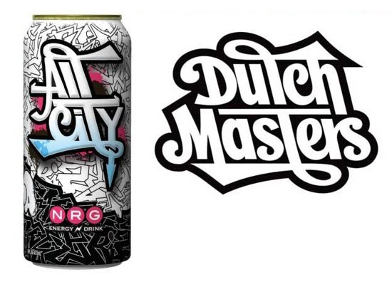
The right one is the logo of the Dutch hiphop radio show from the mid-nineties. It was designed by Niels 'Shoe' Meulman around that time.
Here is the logo as it appears on his site.
Quincunx!
Ya I'm not sure how these two wound up together. I got this image from a hip hop blog. Not sure what the connection is between the two, aside from the fact that they appear to use the same type treatment. Maybe Shoe was involved with both, although I think I read that the All City design was someone else.
BTW, I checked out some of your work. Furet is rad. Your calligraphy is ill.
I also have no idea what the connection between the two is. To be honest, the lettering on the can looks kinda clumsy compared to the Dutch Masters logo.
And thanks for the compliments about my work. I spot some graffiti influence in your work. My love for letters partly comes from my graffiti days. ;)

It was designed by Vincent “Fact One” Ficarra of Mpire. I didn't check to see if he's affiliated with Dutch Masters.
Captured from web.archive.org on 15 Jan 2015. view this capture
