
I'm sure everyone has seen that Paul Rand's Yale Press logo is being phased out in favor of Matthew Carter's Yale typeface.
I have to say, generally I lament the lose of a Rand logo, like the classic UPS logo, but in this case, I wasn't a huge fan of the Yale logo. I've tried understanding the construction of the type and the geometry and I don't quite see the reasoning in it. Here's my quick study of it:
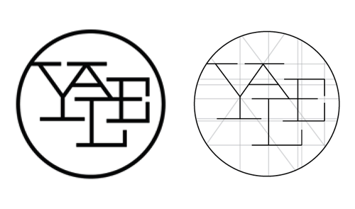
If anyone could shed some light on the grid, the negative space, the reasoning I'd love to hear it. Based on all his other work and the fact that he's considered to be the father of logo design in America, this one seems inconstant and idiosyncratic.
