
Hello,
1. does this work?
2. does it say holiday?
thanks!
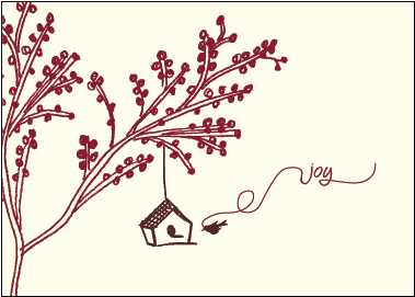
Hello,
1. does this work?
2. does it say holiday?
thanks!

It says more "spring" than "holiday" to me.
Also, you can try to revise the flow of the line connecting to "joy".

Holiday is very abstract and difficult to communicate. There is nothing about the home to suggest its in a holiday season.
I concur with riccard0 that is conveys spring or family.
Do you think just changing the colors would help...like white paper and maybe an ice blue house or maybe change the word from joy to merry? Open to any suggestions...

To convey "Holiday," I would remove the red berries(?) from the tree. And maybe change the tree to a light blue and make the bird red.
Because you're in Florida, your concept of winter is a little different than mine, being in Boston. While you might think of birds arriving "home" in the winter, I think of them leaving. I mentioned making the bird red because cardinals are one of the few bird species that sticks around here in the winter(or at least is active in the winter).
I also think that if you send this around the Holidays, it would have more of a Holiday feel just because of the context. If I showed you a shade of blue in the summer, you might think of the sky; but in the winter, the same shade might remind you of snow.
Okay..thanks everyone...how about this?
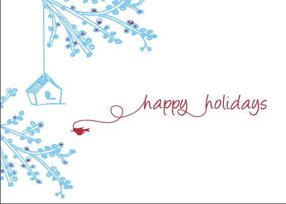
Yes, you've definitely looks more wintery!
does it look as good though? Ever look at something too long and not see it anymore? : )
Wow, my grammer in my last post was horrible, huh? I think I meant to say "you've definitely made it look more..." but I got distracted in the middle of it. You got the idea though.
For what it's worth, I liked the composition in your first iteration better.
Okay sch2525,
I think maybe I have got it...what do you think? Just need to select colors.

Are the words saying the right thing?
thanks!

sorry - wrong thread
Now I'm afraid that the style of the tree doesn't match the birdhouse/bird. The tree is too "realistic" and intricate, whereas the birdhouse is bolder, more abstract and primitive (in a good way).

go with the original
it says christmas to me and the colours are great

I also prefer the first one, but perhaps you can make ‘joy’ larger - it is overwhelmed currently. Would help both compositionally and on a communication level, and also make it more festive. To that same end - the swirling of the ribbon can be a lot more involved.

if you're conveying holidays, its almost necessary to throw snow in there somewhere... thats the one element i find to be really missing. spring, though, works.
Captured from web.archive.org on 24 Jul 2014. view this capture