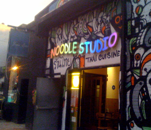
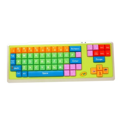
This topic came to mind when I saw a fellow design student propose setting a magazine masthead in Bell Centennial. I couldn't help but think of some HF&J material set in Retina, a typeface designed for a similar purpose, at very large points sizes as an obvious joke. The difference of course was that this Bell Centennial masthead was no joke...
So the question: What's the most inappropriate case of type selection you've ever seen?
(Let's exclude IKEA's use of Verdana. There's a long enough thread dedicated to it.)