
Just tweaking this one, it's going to be letterpressed on black stock with silver metallic ink. Any thoughts/changes/tweaks? I'm debating on the placement of mark and supporting type in general, but I think it works where it is.
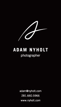
Just tweaking this one, it's going to be letterpressed on black stock with silver metallic ink. Any thoughts/changes/tweaks? I'm debating on the placement of mark and supporting type in general, but I think it works where it is.

I think everything works where it is. The only comment I'd make is that the 'A' mark looked like a script 's' to me at first.
Thanks Colin. I can definitely see how you see an "s" in the mark, but that was actually developed a while back and is pretty recognizable at this point so it's not something we're looking at changing.

I would like the mark a bit more to the right for visual centering. It may need to be marginally smaller as well.
Also, it may be fortuitous to hack the ‘www’ off the URL - the resulting inverted triangle should echo the Adam Nyholt / photographer block above it, and also help with a slight lack of ‘air’ at the lower edge of the card.

the font used for photographer and the rest looks a little bland. but especially for photographer
tell me more about why you decided to put the three bars of info in that order... did descending from the shortest to longest line length look so bad? is the order based on what the client wants communicated or are you trying to achieve a more squared block of info? for some reason it seems out of place to me, but i'm not sure of the solution
Captured from web.archive.org on 26 Apr 2015. view this capture