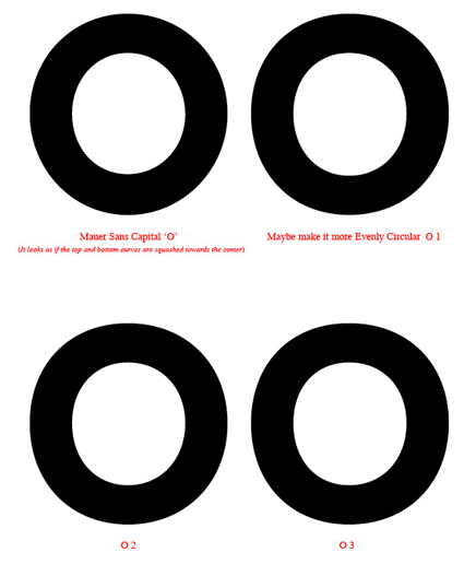
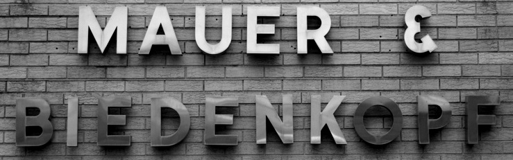
There's a building at the end of my street that has some really nice steel letters on it. The business no longer exists, but I'm guessing from the building itself and the style of type (and my knowledge of the area), that it's from the 50s or 60s. I thought it would be fun to extrapolate an entire character set from the limited characters on the sign (see attached). The typeface is definitely in the Neutra/Avenir/Futura/Gotham area, but it's the ampersand that really sets it apart. I wasn't able to identify the original typeface, and the ampersand isn't like anything I've seen.
So here's my first attempt. To me, the uppercase looks pretty cohesive, and the lowercase is getting there. As far as the numbers go, I know my 5 and 8 still need a lot of work.
Let me know what you think.
thanks!
Jonathan
| Attachment | Size |
|---|---|
| mauer sans 2 sample.pdf | 232 KB |
| mauer.jpg | 92.73 KB |
| mauer sans 4 sample.pdf | 248.45 KB |