
From the cover of ZZ Top's Tres Hombres album (1973):

From the cover of ZZ Top's Tres Hombres album (1973):

wow i have this album on the top of my stack right, i kid you not! i love the inside fold... big greasy mexican dinner!
In the spirit of unbridled creativity,
Troy Vera
Kingdom Graphics
http://www.kingdomgraphics.biz
Yahoo IM: kingdom_graphics
Skype: kingdom_graphics

I don't recall seeing it in any specimen books. Don't see anything like it in Solo or P-L. Might have been custom.

Since there's not a single curved line in it, this would have been a slam dunk to draw by hand, even in 1973.
How about the other style used on the cover?:
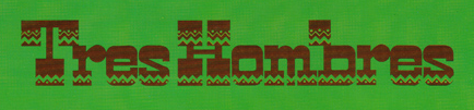
If this one is a typeface, I'd guess that the other one is as well (but anything's possible).
I would say the same about that one. The zig-zag pattern is different in the two "res" sequences, but that is probably because it was added after the letters were assembled/set/drawn. It's possible this was a film font, but definitely not a wood typeface because of the top of the "b". It wouldn't have been designed like that.
I remember listening to this album in college. Really good, as I recall. Better than their later stuff.

Mark Simonson wrote: »Better than their later stuff.«
*sigh* Unfortunately, yes.
Captured from web.archive.org on 19 Apr 2015. view this capture