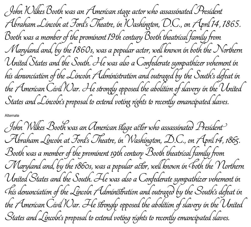
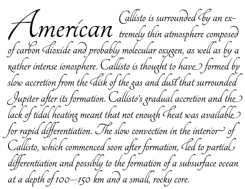
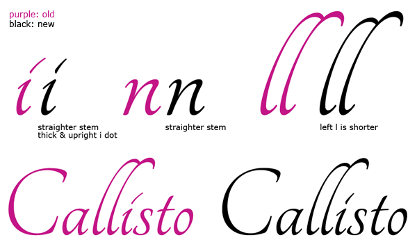
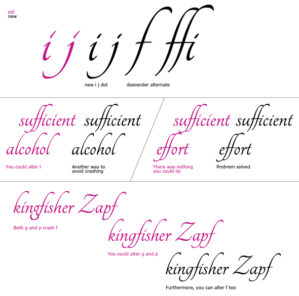
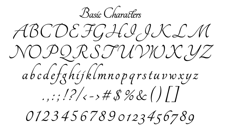
Hi, everyone. I need your critique on my new script type. Since I am Japanese and have never designed a script type, I don't know if it's aesthetically good or bad. There is certain amount of alternates and ligatures, I did not post those images though.
Although this was supposed to be a display type,but one part I think that is cool is the shortened lowercases to avoid clashing the descender from upper line (see 'Alternate' section). I think it works nicely, but how do you feel?
Anyway, tell me anything you felt. I really like to know.

| Attachment | Size |
|---|---|
| Dots comparison.pdf | 29.25 KB |