Typophile

DSType releases Dobra Slab and Finura

dstype

DSType introduces some of the latest releases. Comments welcome!

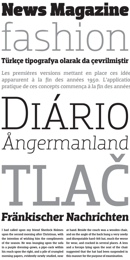
Dobra Slab
Dobra Slab is robust serif companion to Dobra and it's available in 5 weights with matching italics. Soon available for licensing.
http://www.dstype.com/index.php?id=63
Finura
I don't even know how to describe it. I designed it by impulse and I wonder how it's going to be used! Soon available for licensing.
http://www.dstype.com/index.php?id=61
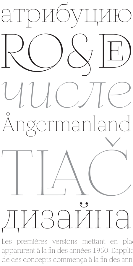
What a beauty ... Finura ... I like it! With a strange ”a” which definetly refuse to collaborate ;-) I think we are going to see this font in magazines or on packaging.

More great work Dino, look forward to adding them to our DSType collection on www.type.co.uk

Dino, beautiful work!

Lovely!!!

Thanks to all of you. Glad you liked it.
This has been a very busy year, so there is much more to come.

I will now start to design Grossura, that is the opposite of Finura, a very heavy, high contrast typeface, based on the same master.
I will keep you guys posted.

Best,
Dino dos Santos
DSType

I am looking forward to seeing Finura in use! Bringing all those ideas into one typeface and having it look so elegant and refined is quite an accomplishment.

Beautiful stuff.

Gorgeous design! Keep it up!

Captured from web.archive.org on 18 Aug 2013. view this capture