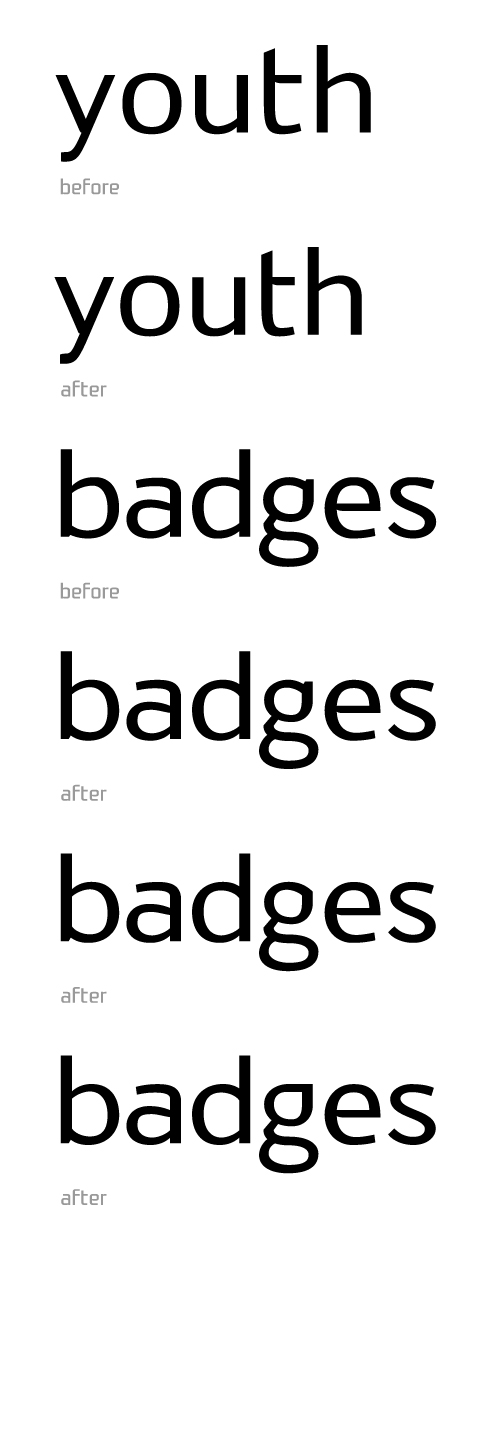
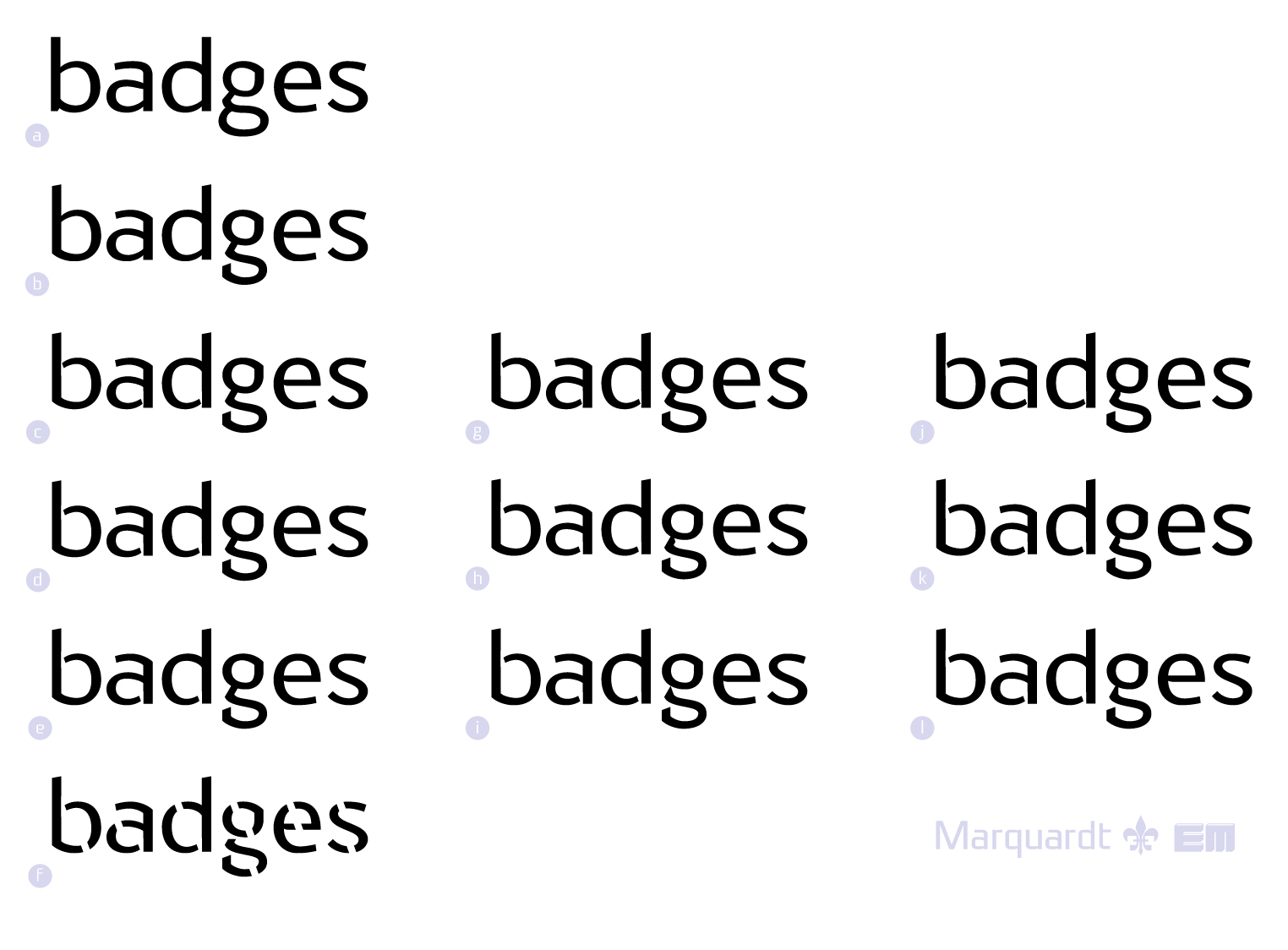
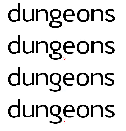
A while ago I posted a novelty font I was working on called "Marquam". I decided to significantly trim down some of the obscuring features. This is the result, but there are still improvements that can be made. Here is what it looks like so far. The text setting here is a bit ambitious but I hope it reveals some of the problems that need working out. Please critique me!
Thanks,
Eric
| Attachment | Size |
|---|---|
| Marquardt-typohile.pdf | 32.36 KB |