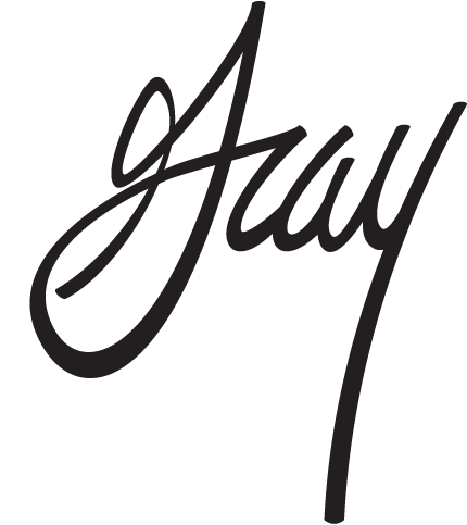
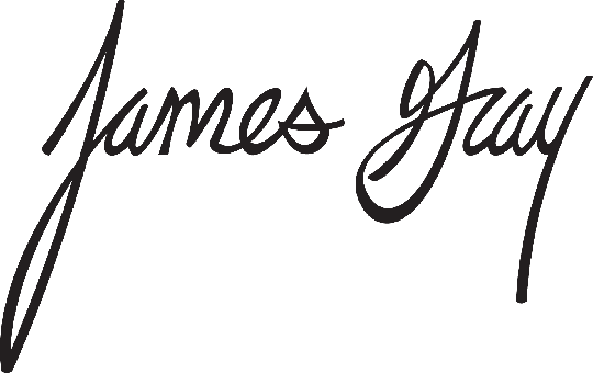
I am in the process of creating a vectored version of my signature. So far I have only drawn the last name, "Gray" but my full name is "James Gray." I was hoping to get some feedback early before I spend too much time on it. Should I vary the weight more/less, too slanted, change the X-height, legibility... I'm not too concerned with staying true to my penmanship because to be completely honest, it's a little sloppy. Anyways, with that being said, here is what I have so far, let me know what you think. I know it needs work.