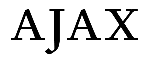
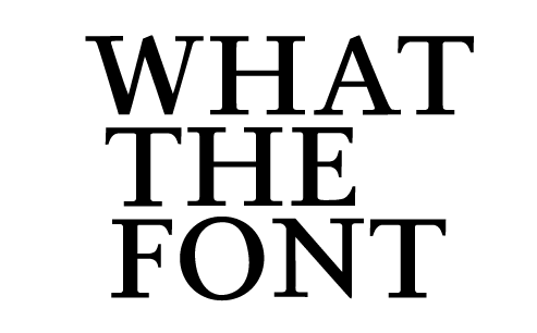
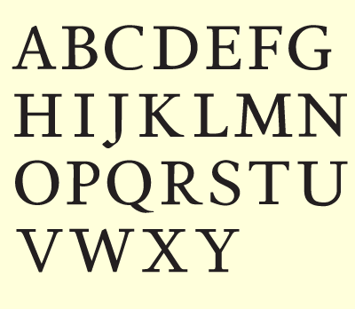
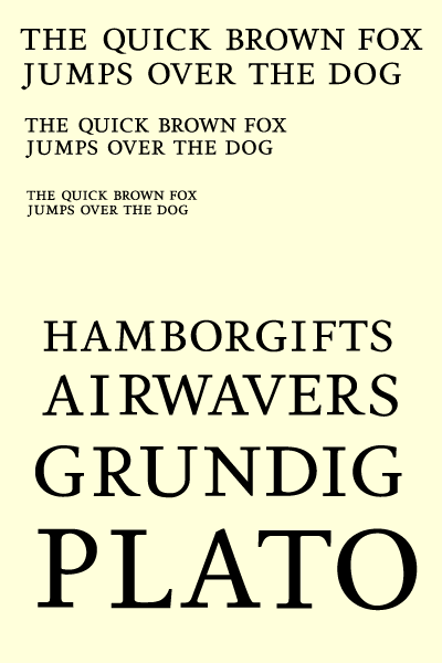
What I have here is only a few Capital letters. My intention is to have a text serif so I should maybe start by redrawing a regular book weight. But hey I thought maybe get a little feedback on the very little work I have.

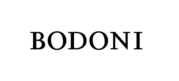
I'm drawing this on Illustrator. Is it a bad idea?
Thanks for any feedback. :)
| Attachment | Size |
|---|---|
| DentalNewsPDF-2009-10-10.pdf | 159.87 KB |