
I just thought I'd let you all know that I am teaching a Type Design class at SVA Continuing Education on Tuesday nights this fall.
James
I just thought I'd let you all know that I am teaching a Type Design class at SVA Continuing Education on Tuesday nights this fall.
James

Is your curriculum focused primarily on designing the font without dwelling much on the software side of things?

This better be expensive James, or your hard-assed type-biz rep will be tarnished forever :-)
The course is about designing type. The approach is agnostic. Drawing, font editors or illustration applications are the students choice. I encourage students to use FontLab Studio 5, and last semester most did. But some chose to do the work in Adobe Illustrator and some chose to draw with paper and pencil.
Without using a font editor, the course essentially becomes "Alphabet Design", but ultimately it is about drawing letters and "system design".
BTW, that's the way to teach type design, as opposed to training production workers.
Sounds good. I’ve registered, so now you have to put up with me in person for an entire semester.
Can you finish a new typeface in 13 weeks?

23rd street is my favorite street in Manhattan.
It avoids the excesses of 34th Street to the North and 14th Street to the South but yet has the same number of traffic lanes. :)
You'd think, to preserve the mathematical balance, 24th street would be the boulevard, not 23rd.
I once taught a class on migrating networks when MS Windows 2000 Server first came out, not far away but on the west side.
Because of the prep I had to do, I ended up learning more than the guys I was teaching, by far.
Enjoy.
(Is auditing allowed? I'll be in NY a couple of times this fall.)
I don't believe there is an auditing policy. It is Continuing Education after all. But if you want to sit in on a class when you are in town, let me know and I can invite you as a guest.

So when does the online version start? NYC is a long drive from Ontario.
Online type design instruction. Really? How would that work?

> Can you finish a new typeface in 13 weeks?
When I've taught my own course at ArtCenter (14 weeks, 3 hours per week) I've personally expected no such thing. My own ambition has been to simply reveal to my students how scary it is! Some of them can handle it, but I don't think it makes sense for anybody who tries to succeed, at anything really; but even the ones who will never try again at least develop an appreciation for the ones that will (and do).
hhp
Can you finish a new typeface in 13 weeks?
I can assuming I control my boneheaded impulse to make everything into a multi-weight family with an extended character set that requires skill far exceeding my own.
When I taught undergraduate type design I always expected the students to finish their typeface in the allotted time (15 weeks 2:40 per session). One weight, full character set (western european latin) with one OpenType feature. I explained to them that a professional would do the work in about 200 hours, so they should allot at least twice that much during the course of the semester.
I made it clear at the beginning of the course that if they didn't finish, they would fail the course. Without that pressure they had no incentive to work hard on their projects.
Did they make good type? Hardly. Some of them came close, most were obvious first attempts. But they were exposed to the process, they learned how truly difficult making type was, and they all had a deep sense of accomplishment when they used their newly finished font to design a poster showing it off. Most told me it was the best design course they ever took.
Continuing Ed is a different environment, but I still expect the commitment to finish what one starts.
@terminaldesign
Gee, you're tough! I'll let you know if it looks like I can come by when in NY. I'd like that a lot. Thanks for the invite.
Richard
I don't think I'm tough. I try to be honest, and give students their money's worth. I have been teaching a long time, and I think the biggest mistake new teachers make is not having high enough expectations of their students.
You set the bar high, and see who can get over it. If no one can, you can always lower it a bit for a particular student or class. But if you set the bar too low to start, you've cheated all of those students.
> Online type design instruction. Really? How would that work?
You would be surprised at the tools we have now. For instance, you and I can be connected (along with 12 or more other students) and if you are teaching I will be able to see your computer as you draw a character in FontLab, while listening to you explain what you are doing. I can't see how that would be more difficult than in a classroom.
In fact, with the software, if I have FontLab, you (as the instructor) can see my FontLab screen as I try to do an exercise, and you will quickly see where I am going wrong on some task I have misinterpreted.
I firmly believe type design is an ideal subject for online learning, because the numbers of people who are interested in learning from an expert are generally scattered in many different locations. Only those living in the megopolises get to take courses like this one otherwise.
> I think the biggest mistake new teachers make is not
> having high enough expectations of their students.
True, although -like you said- there's a big difference between a
required course and an "adult" class: in the former it's difficult
to have too-low expectations... :-/
> I firmly believe type design is an ideal subject for online learning
Indeed.
One software I've used to great effect with 30+ students (not for type
design however) is NetSupport*. It's not cheap, but it can do almost
anything, including transmitting audio, allowing remote supervision
and even taking control of a user's computer (yes, scary... for them :-).
* http://www.netsupport-inc.com/
hhp
Don,
That all sounds very interesting. I'd like to discuss the possibilities with you off line if possible.
James

James,
Define "Finish" :-)
ChrisL
I firmly believe type design is an ideal subject for online learning…Only those living in the megopolises get to take courses like this one otherwise.
I’m pretty sure that online learning is the foundation of type design instruction for many people. The problem is that it hits a wall at the Typophile crit thread. Screencasting and sending PDFs proofs of design around would be a huge plus in learning type design for people not near cities with type designers.
Chris,
In this context finish means, complete character set drawn (WIndows 1252/MacRoman) properly spaced and kerned and with one OT feature (usually ligatures, but some students have done small caps or some sort of contextual alternate). And a poster or some other piece of collateral that shows that the font functions.
Does "finish" mean productized and ready for commercial release? No.
> I’d like to discuss the possibilities with you off line if possible.
You can type my name into the field at http://inside.lambton.on.ca/custom/phonelist/index_html to get an email link. If you want to talk to my live, we can set up a time for the phone.
Thanks, James. Those last steps before release can be time consuming as well for the neophyte type designer.
ChrisL
Well,
The semester finished last week, most everyone in the class got pretty far along in their type designs. A lot of good stuff!
I'm teaching this course again for the Spring semester on Tuesday nights. You can check out the course details Here.
Cool. Will it be shown?
hhp
That will be up to the individual students. I know several are working towards a commercial release at some point in the future, and they may not want to tip their hand.

I'd like to share mine. I could use some more feedback. Though I'd like to think that someday I too might release something commercially, this particular design is nowhere near ready for that (on the less-far-along end of the class completedness spectrum). The caps are mostly awful and my curves need lots of work and lots of other things need work, but I'd quite appreciate any thoughts or suggestions or encouragement (and actually discouragement if it's appropriate).
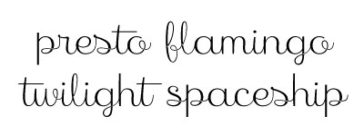
So I tentatively present: Retro Upright III (working title), a playful upright cursive connecting script. pdf specimen

I like it! And think it would deserve its own proper thread.
http://typophile.com/forum/26
Gillian, I think it shows promise.
Its own thread, please! :-)
hhp
Captured from web.archive.org on 15 Oct 2013. view this capture