
Anything similar, anything in that range. Book is by Mercator Gerardus from 16th century.
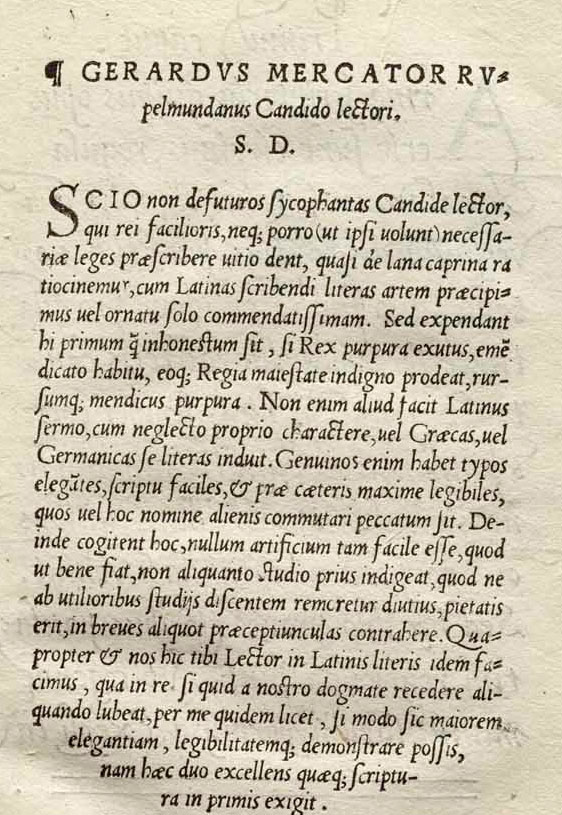
Anything similar, anything in that range. Book is by Mercator Gerardus from 16th century.

Just an idea:

Since Gerardus Mercator was Flemish howabout Custodia from Netherlands finest:
http://www.fontshop.com/fonts/downloads/ourtype/custodia_ot/
BTW... OurType is planning to add more weights of Custodia soon.
Wait a second. Do you want something literal like this
IM Fell:
http://iginomarini.com/fell/the-revival-fonts/
or
a smooth contemporary interpretation like this:
http://www.typography.com/fonts/font_overview.php?productLineID=100010
and this:
http://www.fonts.com/NR/rdonlyres/AAEE08E7-01D3-4335-BD59-B6356349BCE2/0...
Mikey :-)
Nice suggestions so far. There is also Mercator which was inspired by similar sources.
Ahh, but that is not a book serif, pardon. Maybe Jenson.
Stephen that Mercator Set is exactly what i want. So Jenson is most similar to Mercator Set?
Which contemporary digitalized version is closest to Mercator set that has regular weight?
_
Sandro
Sandro, just so you know the Mercator that Coles referred you to looks nothing like your sample and will not print that way either.
Look into Adobe Jenson
Mike it is ok, that typeface is from that same book.
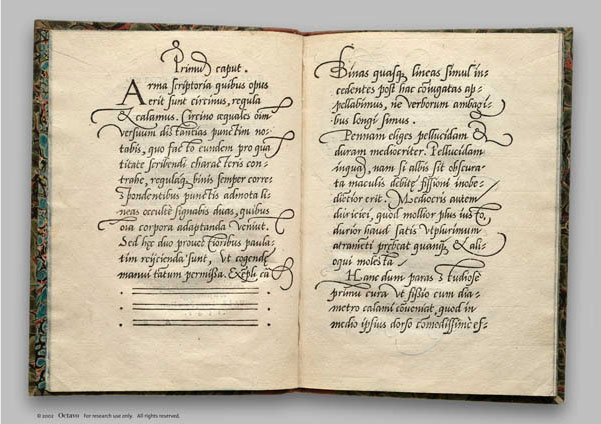
I am not looking for typeface that will have literal printing result. I need something close to it, regular and italic because I am going to create lettering for title based on Mercator's swashes and cursives.
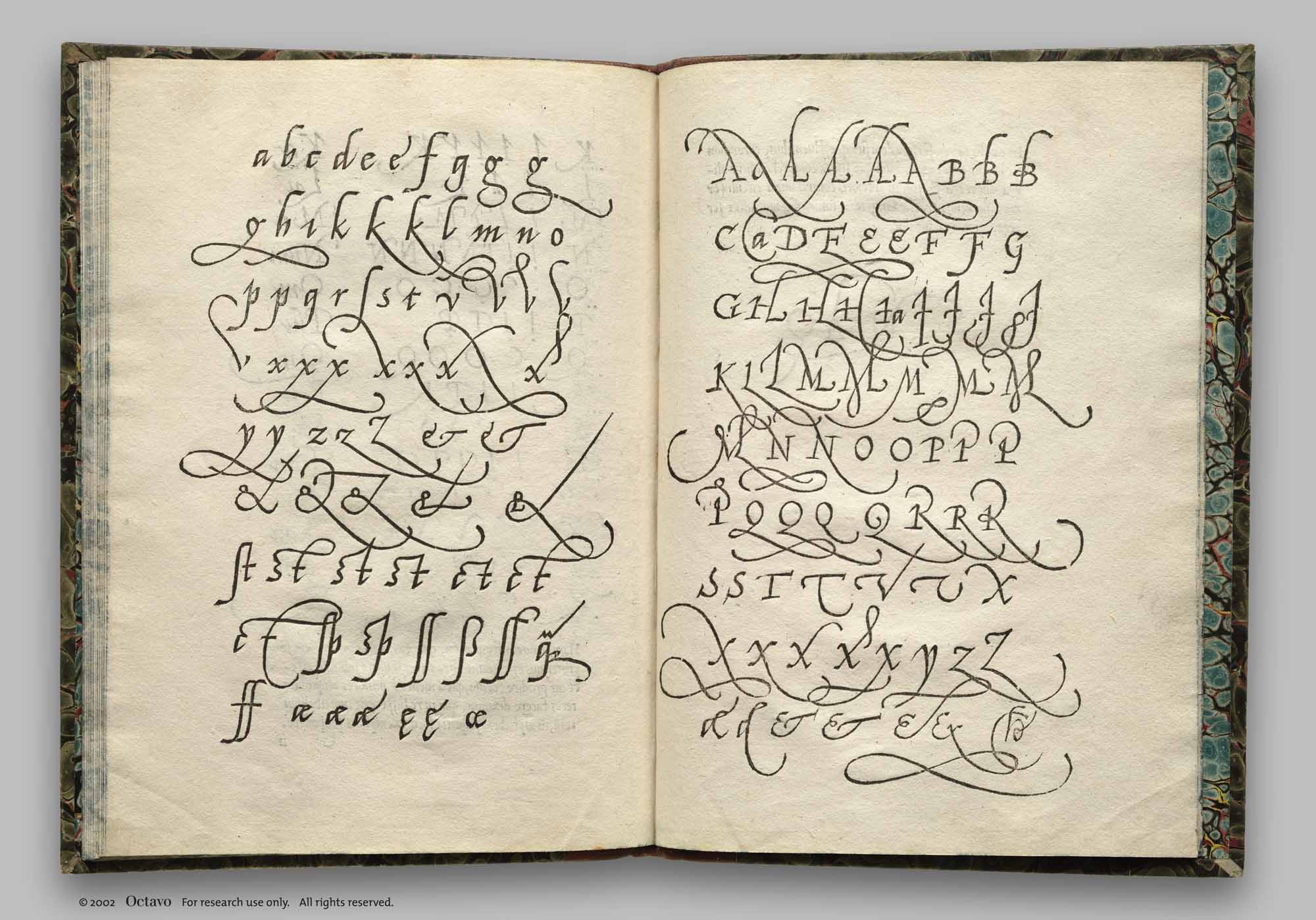
Found it on welovetypography.com, located in rarebookroom.org. It will be the base of lettering.
_
Sandro
I LOVE those swashes!!!
If Mercator Swash doesn’t have enough swashes like those in your second set of images then Adobe Poetica could be used as back up... Look like its the same material just rendered very smoothly not angular from the quill.
Poetica:
http://store1.adobe.com/type/browser/pdfs/POEQ/PoeticaStd.pdf
Yep, it is pretty close. Of course misses some swashes that is of course understandable. What regular would go with Mercator's italics? Jenson?
_
Sandro
Jenson is the perfect balance between the sharpness of Mercator and the often too soft classical text face.
Do you want to go softer contrast for easy text reading, or yet something sharper still?
Yeah, I agree that Jenson is pretty soft. Anything sharper would be? I am dealing currently with Haarlemer with current poetry book that I am designing.
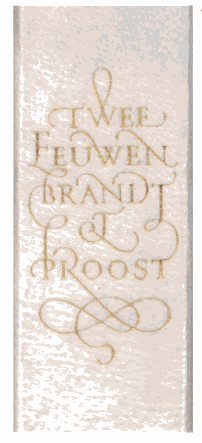
I am totally in love with this Brand Proost book and this lettering. I am trying to find a middle, a typeface that almost looks like it and a typeface that will work good with idea of Mercator's swashes and create new lettering for the title of book that I am designing.
_
Sandro
I know it’s probably not the best idea to be too matchy-matchy with the scripts and your text.
What do you think of this these sharper types?
Augustin
http://new.myfonts.com/fonts/ludwiguebele/augustin/
FF Maiola
http://www.fontshop.com/fonts/downloads/fontfont/ff_maiola_pro/
Adobe Warknock:
http://new.myfonts.com/fonts/adobe/warnock/

And for swashes, try Incognito. That should be pretty close to that book spine.
@ Mike: I encountered Augustin a while a go. Love it, modern version of Jenson.
@ Auricfuzz: Incognito is also one of gems that resemble Mercator's work. Trying to find a serif that would be close match to it. I will probably draw my own swashes based on all these shown here.
_
Sandro
Well, Incognito has a roman and italic that should work perfectly with Mercator-style swashes. Though perhaps it's not ideal for extended text.
Captured from web.archive.org on 9 Jan 2012. view this capture
