Hi there,
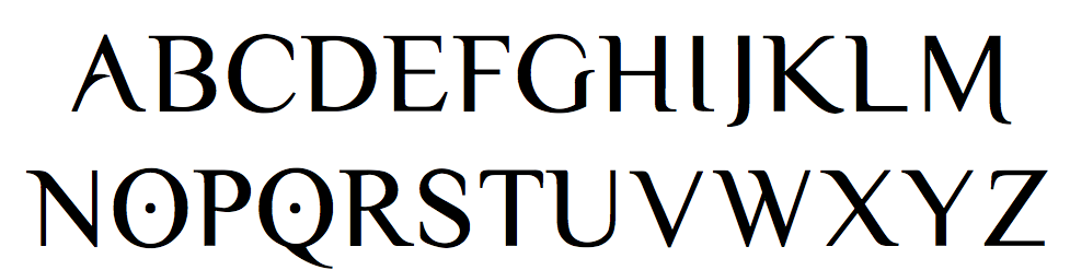
I'm wondering if this font wasn't based on a commercial previous design. The author gives it for free at his website:
http://www.ericolebedenco.com/yellowmag.htm
Downloading the font and looking into, I can clearly see the Times figures there. Then, for this limited charset and lack of proper figures, I would think that this is a student/beginner/free font work. But a few pointers are leading me to think that this was based on someone else's work. For example, the right serif on F top is slightly bigger than on E - to compensate the bigger counter space - but hey, no dummy would know that...
Can you think of anything that could be the source of this?
Thks