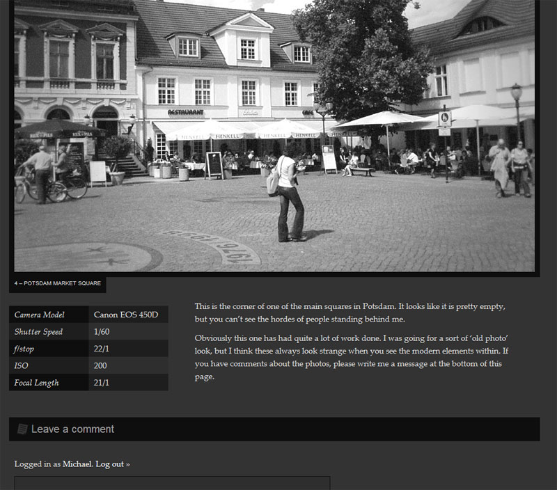
I'd like some critique on this new website I have just finished. It's a personal photoblog. There isn't really much in the way of text, but what there is I've tried to make structured and pleasing to the eye, in order to complement the photos.
Have I succeeded? The logo in particular is pretty lacklustre I know, but I'm not really a designer, I'm much more into the backend of web design. Help is appreciated!