Hi,
I'm currently working up a nameplate for a student magazine. The magazine features mostly news features and opinion and will be published four times in the academic year. The magazine is reasonably high-brow and serious, but with a student focus. Anyway, for the nameplate/flag/logo/wordmark, I drew on inspiration from the New York Magazine's nameplate.
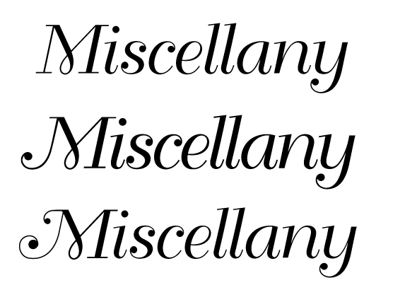
With some help from the Type ID board here, I settled on Bellevue. There are some really beautiful swashes in Bellevue, but unfortunately the M doesn't have any. So I'd like to butcher some of the swashes from other characters and Frankenstein them onto the M.
In the attached image, from top to bottom: Unaltered, first version, second version. I like that there's more to the second version, but with scaling the swashes up and down I feel the scale and weight of the strokes have suffered. Any help appreciated!
| Attachment | Size |
|---|---|
| Cover.png | 13.56 KB |