Hello!
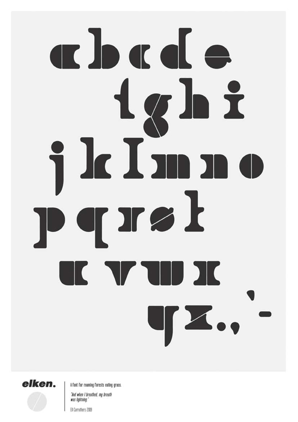
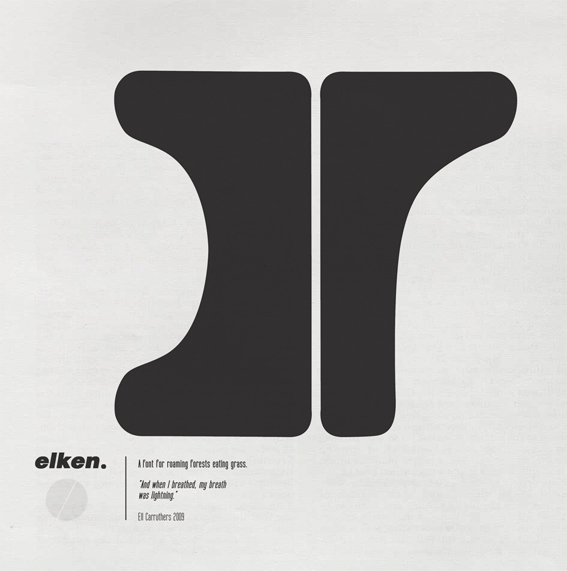
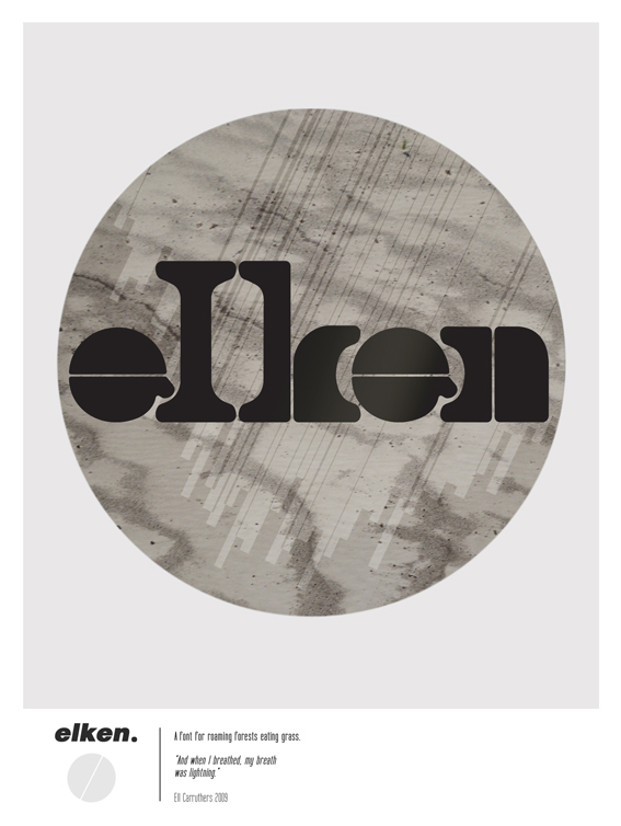
I'm looking for a little feedback on a font I recently designed; Elken - a black, solid, display face with a stencil-type structure. (I didn't set out to create a stencil font, it happened by itself?)
Specifically, I know there are many problems with the spacing/kerning, and I have issues with c, g, s and t. I'd love to hear any comments or criticism... As it is my first font, I have much to learn.