Typophile

Pontifex - please critique

Béla Frank

Hello Typophiles!

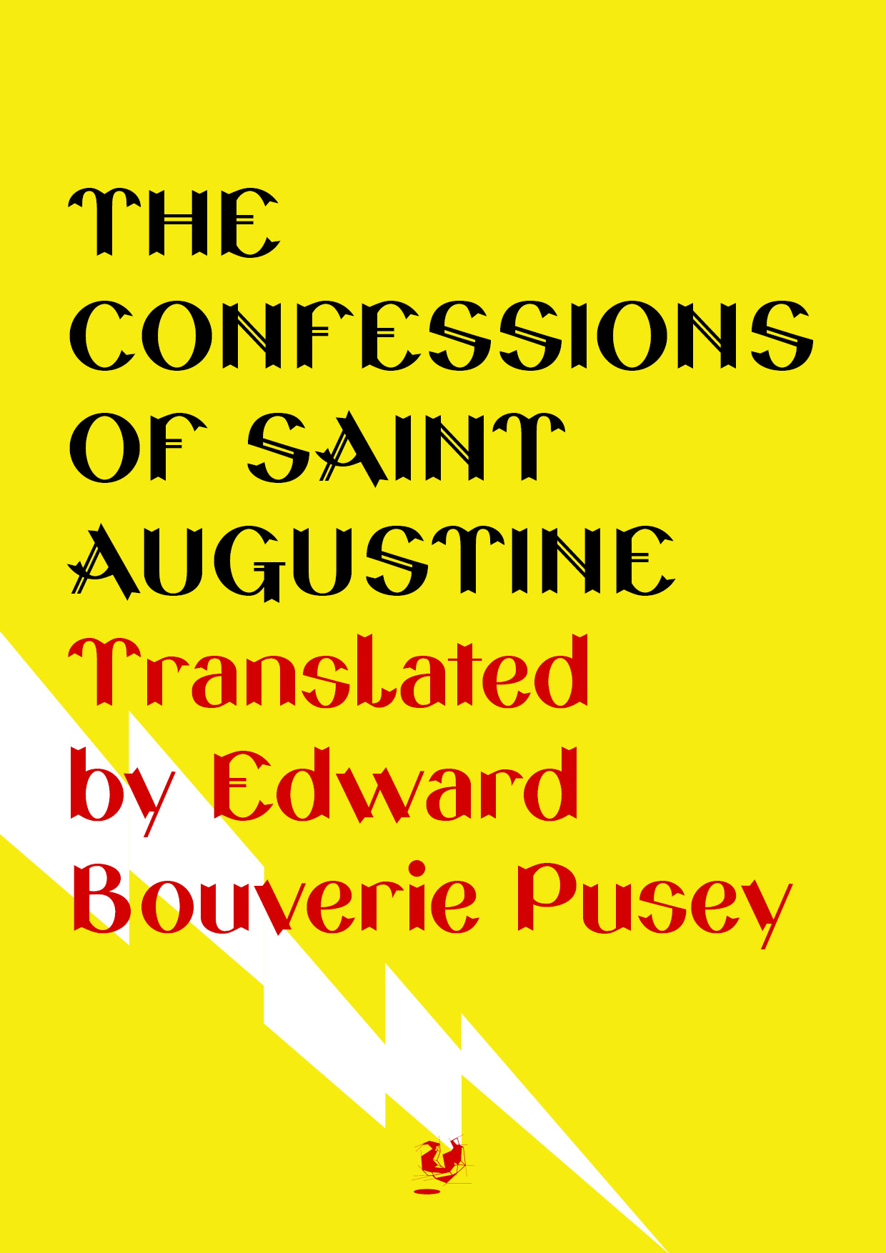
Here I present my latest experiments. Intended to be a title/display font, these are the very first sketches. So far I think it is promising. What do you think about it?

Would be nice to have some Q&Q. Thank you in advance.

P.S.: working title is Pontifex, but I've found a font family named Poppl-Pontifex. I'm not sure if I should change the name. Should I?
AttachmentSize
pontifex_test_01.pdf392 KB

Might want to rethink the name. Fritz Poppl has a Pontifex.

Michael

Could you tell us the concept behind about the experience. It look very Renaissance-ish. is it? or i'm wrong? :D

:)

Started as a project based on a sans lettering I made for a poster some times ago.

I wanted to do that fat sans into an alphabet but in the middle of the process the idea come - adding this unusal terminals. I liked it and kept it.

That's the story so far.

I say, if this is an experiment, then keep experimenting and don't let my (or our) opinions effect your initial intention.

And, yes, I think it's promising and well suited for fancy posters. :D

Captured from web.archive.org on 16 Apr 2015. view this capture