
what are your thoughts on the BRAUN logo? I just noticed this today, but take a look at the "U" "N" combination.
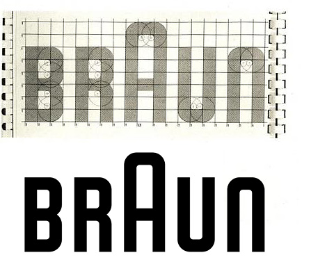
what are your thoughts on the BRAUN logo? I just noticed this today, but take a look at the "U" "N" combination.

I’m not sure what you are seeing, but I sure do love the way each letter was crafted.
Mikey :-)

Roger that. It's inspiring.
I was looking more optically then technically. because it is set so precise to the grid, the "U" seems taller than the "N" and higher on the baseline. Maybe I am going crazy. :-p
courtney

The b/w logo isn't the same as the sketch, is it? The inner shape of the large 'A' seems to be wider than that of the other characters.
Yea, I just did an overly in photoshop, and exactly the same. Although, that middle cell with the "A" is physically a little wider than the other cells.
courtney

The A does look a little wider, but I also see the U looking taller. Technically, for good optics, it should be lowered to have the bowl dip, but I'd be careful. For this type of a face, it might look a bit strange.

Yup, the U is floating as they've not lowered the baseline to optically compensate for that curve. The same goes for the top of the N; it could have been raised a hair. But I still think it's a successful wordmark.

The "A" doesn't just look wider, it is wider. If you look at the cells on the graph, the middle cells between the feet of the "A" are clearly about half again wider than the others.
penn
Wow. How did I miss that.

First thing I noticed was that the U appears taller than the N because of the rounded vs. sharp corners. But penn pointed out the first thing I should have noticed – that the aperture of the A is intentionally wider than the rest of the letters.
The width of the A doesn't bother me. I feel like they did a good thing by increasing that, because the letter is so much taller, it needs to be wider to support itself against everything else. Just the "U" "N" Combination bothers me, because the further away you are, the more of a gap appears because of the curve of the N.
courtney
Captured from web.archive.org on 19 Oct 2013. view this capture