Hi,
I'm putting finishing touches to a logotype and have a small question regarding two letters in it. I'd like to ask you to have a fresh look at it and let me know if my thinking is right :)
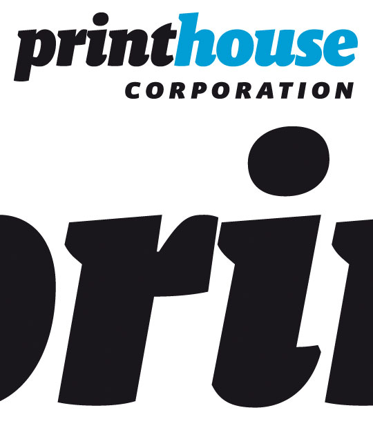
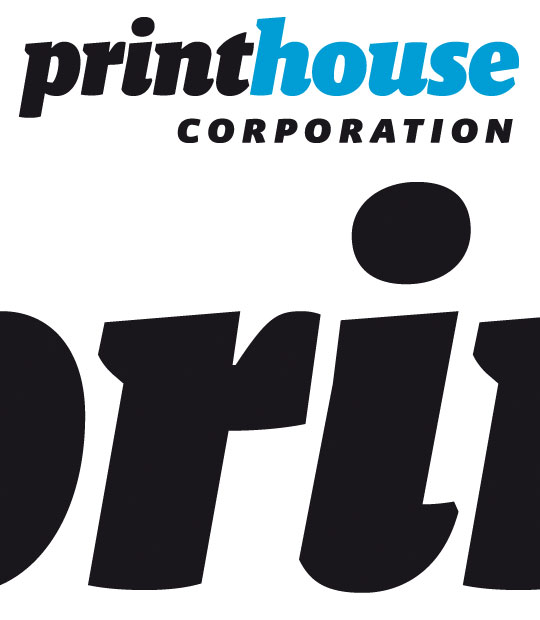
Because of tight kerning the serif of the 'i' is very close to the 'r' and I'm not fond of the look of it. So I connected the glyphs (in small sizes the gap disappears anyway), trying not to destroy the shapes of the font (Malaga):
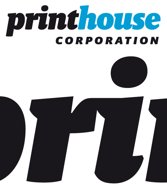
Do you think it works? Can you think of a better solution maybe?
Thanks,
Aleksander