
hello everyone,
This is a title for a web 2.0 company that also focus on graphic design
What do you think ? is this okay ?
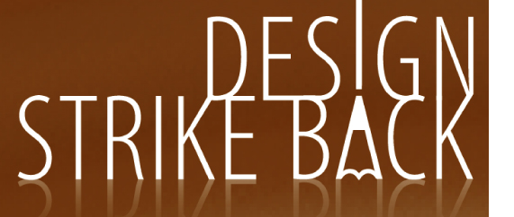
hello everyone,
This is a title for a web 2.0 company that also focus on graphic design
What do you think ? is this okay ?
OOOOOps, forget a letter, sooo sory, i really should improve my english


I like the drawn line concept and the armin hofmann reference in the pencil tip form but is the refection necessary?
To my mind it makes it more 'design and photoshop effects strike back'.
If you are really attached to the reflection the mirror image of the a/pencil doesn't seem quite right with the central bar.
Will
Thanks Will,
The reflexion was to emphasis on the fact it is a "web 2.0" company, but the typo will already be on a picture, i agree it is not necessary and was removed.
Wich A do you think works better ?
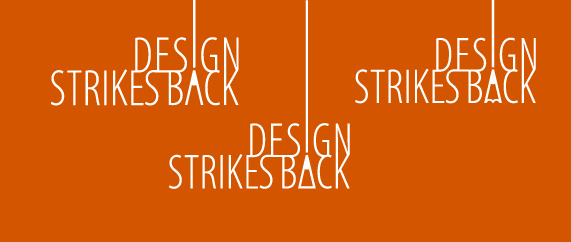
Just corrected a little the kerning in 'Strikes', i'm not sure about the 'i' of strikes
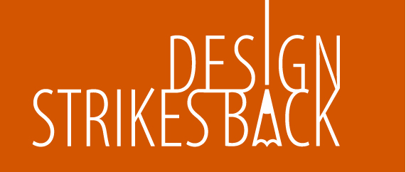
Top left is my favourite.
Is there a way to have tighten the kerning of 'design', it looks a lot looser than 'strikes back'?
Will
oops double post

drop the reflection and give the words some leading/line-spacing.
Hi there,
i've made some correction in regard of your crits, i tighten a little the kerning of design and made some line space.
Is it going better ?
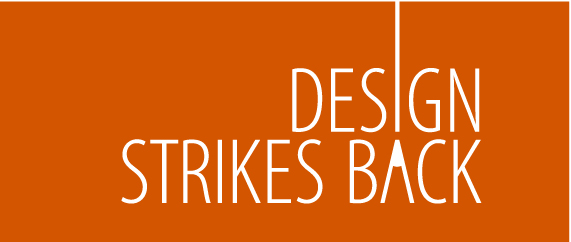

That's pretty smart looking - for some reason it reminds me of the titles to Kuberick's "Dr. Strangeglove". I don't know how well this will work at smaller sizes though.

Agreed. The leading made all the difference. Now I can really focus on the pencil tip...which looks great by the way.
Bring back the arches on the bottom of the pencil though I say.
Thanks for your comments.
I've made a little change to the previous pointy bottom of the pencil. Does it fit better with the font now, or the pointy version was better ?


I think it would be better to leave the bottom of the A open.
you're right ricardo, with the arches it make it too much scolar, it's better without.
Thanks everybody for your support and comment.

@Lefty:
Is the logo already fixed/finalized? If not, I want to share a suggestion to make an alternate version where "strikes" is positioned below "design," instead of having a tall "I" at the top.

I’m seeing a broom or a rake or scuba flipper. Then it takes a second to see what your trying to convey.

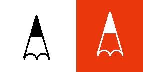
Exactly. And if the pencil was showing more the metaphor would be more readily apparent.
First, thanks all for your comments.
No Jimmy this is still a draft, i have plenty of time to finalised it. i have a three line version here

Mike, Victor, i see your point about loosing the visual cue, but right now i have no clue how to correct that since i have to use white.
The visual cue is the continuous extending line (also rounding the white triangle helps).
You don’t “need” to see the pencil (just like you don’t need to see the arrow in the FedEx logo) and certainly you don’t want to see a broom.
Keep it simple and subtle.
If someone don’t see the pencil at first, they will feel a sense of discovery when they did.
Hello Thierry, personally I prefer the left-most version, using your previous tall "I". But for the letter "A", I prefer the right-most version, which still resemble an alphabet.
Thanks Ricardo, thanks Jimmy, i totally agree with you. Sure i don't want to see a broom or a scuba flipper, simpler is better.
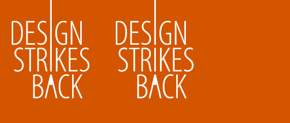
i have two versions since, personnaly i prefer the first - stronger - but the second could be more subtle and more - how to say - playfull, fun, puzzling - or a word like that
Captured from web.archive.org on 25 Jul 2014. view this capture