
When Kris Sowersby, Christian Schwartz, and Erik Spiekermann were designing the parameters for FF Meta Serif, they spent quite some time on details like the thickness and the shape of the serifs — should the face veer towards a slab with blocky, heavy serifs or should it be more of a traditional book face? In the end, they went for a “normal” serif face with fairly solid serifs, but some thick-thin contrast and counters that aren’t totally parallel to the outside shape of the letters. Stronger and thus more useful than Times New Roman while not as constructed as Rockwell. They did, however, like some of their explorations into a “humanist slab” so much, that they asked Sowersby to develop the initial sketches further as a companion for FF Unit. That, in fact, is FF Meta’s more serious sister, and it looked good with heavier serifs.
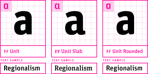
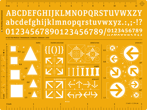
The new FF Unit Slab is a fairly condensed slab which pulls a punch in bold headlines and looks surprisingly good in text with its typewriter-like discipline. Its serifs are decidedly no-nonsense and un-selfconscious. FF Unit Slab can be mixed with FF Unit, of course, but also works as companion to FF Meta. The two families share a common heritage and like to hang out with each other. FF Unit Slab Pro adds Central European, Turkish, and Extended Latin character sets.
FSI FontShop International designed a digital specimen which you can enjoy on Issuu as well as on Behance. Typophile moderator Yves Peters wrote a continuative article on ‘The Creation of FF Unit Slab’, where you can download the PDF as well.