
Hi. Well I'm making a flyer for an artshow. What do you guys think? Any suggestions on improving the flyer would be greatly appreciated. Thanks typophiles!
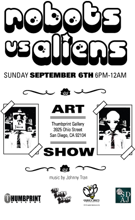
Hi. Well I'm making a flyer for an artshow. What do you guys think? Any suggestions on improving the flyer would be greatly appreciated. Thanks typophiles!

My teacher used to tell me to write the complete date information, including the year. :D
I'll set "music by Johnny Tran" in bigger size if I were you, because it's also the one that attract people to come. And also set the sponsors logo smaller, if they don't mind, of course. :D

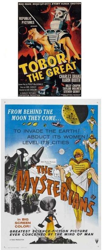
When I read the name of the show, and see the the trippy 70s headline font, here's what comes to mind:
Here's the problem: It's too damn tasteful. The carefully balanced layout with elegant flourishes and double rules undermine the B-movie aesthetic you're (probably) aiming for.
I'd start by throwing out the grid. Make the whole thing more crowded and busy. Be more adventurous in your choice of body type(s). Make the 2 photo images bigger, and tilt one or both of them. If I were designing this, I'd put "music by Johnny Tran" in a speech balloon coming out of the alien's mouth, but that's just me. (If you do put anything in a speech balloon, don't use Comic Sans!)
Just to clarify what I mean by B-movie aesthetic:

Thanks a lot. Here's what I've done to it since reading the suggestions.

This is what I'll do if I were you:
1. Group and center the sponsors' logos.
2. Position the gallery address below the event's time and date.
But, you're the designer, follow your sense. :D
Nice!
Somewhere in the revision, the phrase "Art Show" got lost, and that's essential information, so you'll need to sneak that back in somewhere.

I wanted to move the address to the bottom, but its hard to move all that around. But thats probably what i should do.
are those movies you posted any good Mojo?
The Day the Earth Stood Still is a great flick, a classic. I can't recall that I've seen the others, but they look like low-budget stinkers.
Regarding your layout question, it doesn't have to be symmetrical. You could move the sponsor logos to the left and put the address at the lower right if you want.
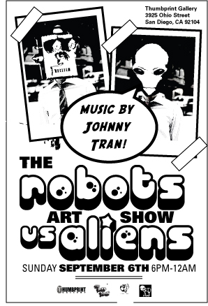

This reminds me of the posters we used to make to promote the underground concerts in college - not a bad thing at all.
A couple suggestions: Try adding a serrated edge to the end of the tape. This will make them look more scotch tape-like.
Right now, it looks like it says "The Robots Art Show vs. Aliens." You'll have to play with that a bit because moving "Art Show" and bumping up "vs. Aliens" will create weird negative space issues.
Captured from web.archive.org on 18 Apr 2015. view this capture