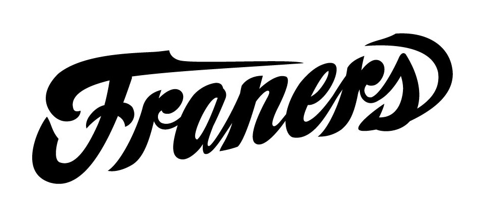
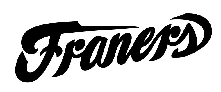
Hello, I am new to Typophile. I am going to dive right on in and see if I can get some professional, honest feedback on a custom lettering mark I am working on for a logo.
I want some good feedback on any and all typographic rules, spacing, weight consistancy etc. Just let me have it.
I am at the point right now where I know its not perfect, but would like to receive feedback before I move forward. right now the a, e, and s bother me a bit.
Thanks!