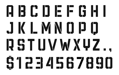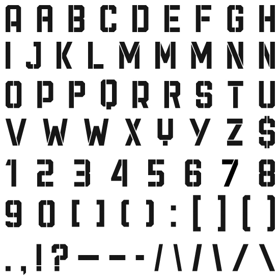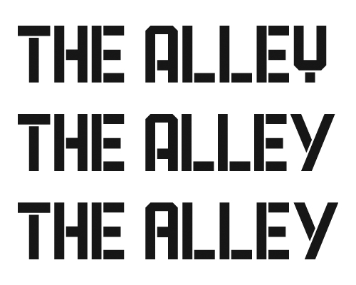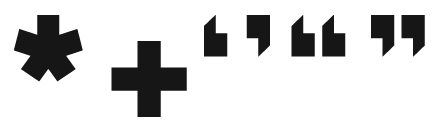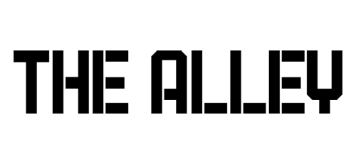
I'm expanding the logo above into a full set of uppercase characters to be used on posters and flyers for the theatre. I'm trying to keep the characteristics intact, like the strong letterforms and low crossbar on the A. I want the letters to look more like type on the sides of old factory buildings or 30s era WPA posters rather than mechanical or robotic.
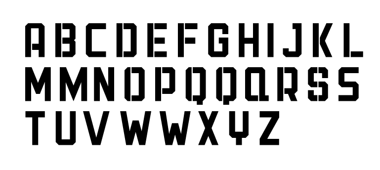
This set of letters is what I was going for but I want to make sure letters like the M, N, X, and K fit with the rest of the type.
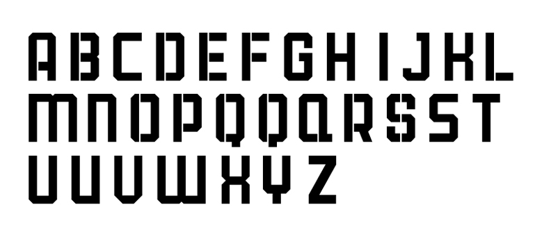
I tried to make the letters more a like but I think the M, N, X, K now look a bit too sci-fi or robotic.
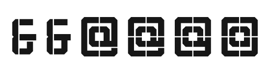
I've also included a couple of alternate character designs that I haven't decided on yet like Q and S. I haven't finished adding all the pylons for the stencil look, but I've got a start on it. Any feedback would be appreciated.