
any ideas? looks stretched, but I don’t think it is?
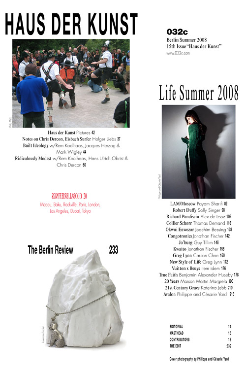
any ideas? looks stretched, but I don’t think it is?

It is, for sure.
Doesn’t it look much more natural like this?

Looks like Helvetica.
I’ve seen it a few times like that lately.
Guess its a new thing. or maybe someone out there made a stretched helvetica typeface?
You guys hate it?
You like it?
I think its interesting.

It’s more of a thing that happens when a person that doesn’t know anything about design, does design. Microsoft Word and several other programs just make it very easy to do it to fit a space. It hurts my eyes.

There is nothing wrong with designing a reverse stress sans and doing the hard work to make it good. There is something wrong if you don’t do any more work than vertically stretch some bundled type and create an ugly piece of camel dung though.
Smells to me like Lawrence of Arabia travelled his entourage by that piece above recently.
ChrisL

I suggest the guillotine for the “designer” : )
Michael

Yeah, a very tall and narrow one.
Jos
How is Calluna doing... now that we are taking a breather from frying the purveyor of scum type?
Not you Fred!
Michael
“I suggest the guillotine for the “designer” ’
Actually, it would be more appropriate to have his neck stretched on a gallows :-).
ChrisL
How is Calluna doing...
The positive responses are still overwhelming me every day. Of course I did hope for people to embrace Calluna, but for a fairly classical looking text typeface I didn’t expect this. As for sales... it’s selling well enough, but not like Museo (Sans). However the regular has already been downloaded lots of times from MyFonts and you never know how many people will come back for an italic or a bold :)

So you demand capital punishment for Mike Meiré?
The International Herald Tribune, in contrast, thought this work was worth being awarded the ‘Best Magazine of the World’ in 2007. Bit of a stretch? This is was Meiré thinks about it:
“If every magazine or every building or every brand or everybody tries to look appealing by using the same idea of being modern, it becomes interesting to go in the opposite direction, because life has different kinds of beauty to present. If people feel confused by it, it is because we are all so used to this kind of efficient, streamlined, correctness.”
“I am always interested in the concept of evolution = harmony/break/harmony …”
You can read more about The Provocative Mr Meiré and The New Ugly on Creative Review.
F
Yer. Ugly can be interesting. And a little change in direction against the mainstream can be necessary now and then. But this kind of provocation merely reminds me of the early days of desktop publishing when having a mac with pagemaker made you a designer. Kings and Queens have been taken to the chopping block. Why not capital punishment for Mike Meiré?
Or lower case punishment.
Jos
Would that mean cutting him off at the knees thereby adjusting HIS x-height : )
Michael
Making him fit lower on the body? :-)
ChrisL
LOL, guys!

If you want ugly, you can find it everywhere. This is a cheap trick, sold to the gullible by the confused. Other than that, I like it :)
So basically it comes to this; ugly=statement=alternative.
Design observer had very good commentary about the new ugly, similar to CR’s.
Ugh. “The New Ugly”…
I see where he’s coming from, but I can’t stand to condone it. It’s like the guy is trying to be David Carson, but knowing what he’s doing wrong. Or trying to be Tibor Kalman without having a worthwhile message. I really hope this done not stick.
David Carson had his five minutes.
At least Carson did something worth appreciating.

On the subject of the “New Ugly,” and excuse the semi-self-promotion, but my boss posted an extended blog entry on the subject a while back: The New Ugly, the Plain Ugly, the Not-So-Ugly: How Do We Define Beauty in Our Craft?.

Fred - It’s not interesting, it’s pathetic. It has no artistic, aesthetic or creative merit whatsoever.
It’s not even worth discussing. So ignore this post.
Nick Cooke

The Haus Der Kunst article is a discussion between Rem Koolhaas and Jaqcues Herzog. The debate is complex and I found it uncomfortable and challenging. That article is certainly not about empirical ideas of beauty – so why look at the magazine design in such terms? Have you read the article Nick?
As I recall I also found the Creative Review article a touch misleading by grouping together various non conformist platforms suggesting they were of the same origin.
I don’t think ugly=statement=alternative sums it up at all.
Yes I have read the article. All that self-aware, ironic stuff gets right on my tits - “hey look, I’ve done something really shite, aren’t I brilliant?”
But then I’m a type designer who spends hundreds of hours trying to create beauty, so it goes without saying that this goes against everything I stand for. After having spent so much time getting glyphs to look proportionally just right, then for some jumped-up **** to come along and receive heaps of praise for bastardizing the shit out of it is particularly galling for most people who design type.
Besides I remember it from the first time round, which wasn’t that long ago, and it was bad then. So to my mind it’s just a lazy rehash.
Andrew - have you read “The Emperor’s New Clothes”?
Nick Cooke
Nick
I don’t know whether it is on line but the article by Heller “The Cult of Ugly” (Eye Magazine) pretty much sums it up. You will get a kick out of it. Especially when G. Swanson gets into the thick of it and starts calling it a visual Tourettes Syndrome and design for design’s sake that seems to say FU without really meaning it!
It is a hoot!
Michael
The article “Cult of the Ugly” is on the web and here is the relevant Swanson material.
http://www.gunnarswanson.com/old/writingPages/EmigreLetter.html
Michael

edgy? maybe. new? not really.
Ugly is still ugly to me.
Wow, Nick, keep your swearing tits on! I’d like to think I was a type designer too (yet to qualify really), but I don’t let that inhibit my appreciation of this approach. I wanted to know what you thought about the article Built Ideology. As I recall the article is a discussion of how to rehabilitate a fascist monument. They don’t tear it down, or tear down those who want to tear it down. They get beyond that kind of binary discussion. Any chance of that happening here?
Now you are all lying on my couch, what are you so afraid of?
The New Emperor’s New Clothes? The New Clothes of the Democratic People’s Republic?
It has no artistic, aesthetic or creative merit whatsoever.
I think I read somewhere that it took MM a long time to get the right stretch, an amount that he was happy with.
Anyway, I’m off to beat up some funny looking different people, then to the chip shop for a sh*g and some Michael Jackson flavoured news.
You can tell he actually has some design skill in the way he composes layouts, but he’s reduced it to a Microsoft Word aesthetic that pisses me off. No matter how much time he put into getting the stretch “right”, it’s not acceptable. It still looks like crap and it’s disrespectful to the design of the typeface.
I understand where he is coming from in the sameness that he found in most editorial design, but he could have found a much better solution.
” think I read somewhere that it took MM a long time to get the right stretch, an amount that he was happy with.”
I find that really tough to swallow :>)
Michael
The Emperor’s New Clothes
A story by Hans Christian Andersen. An emperor hires two tailors who promise to make him a set of remarkable new clothes that will be invisible to anyone who is either incompetent or stupid. When the emperor goes to see his new clothes, he sees nothing at all — for the tailors are swindlers and there aren’t any clothes. Afraid of being judged incompetent or stupid, the emperor pretends to be delighted with the new clothes and “wears” them in a grand parade through the town. Everyone else also pretends to see them, until a child yells out, “He hasn’t got any clothes on!”
Nick Cooke
I know the story. I was trying to think of some way of advancing the allegory, hence The New Emperor’s New Clothes. There is a double edged quality to the original tale that can make the person who invokes it a slave to it’s logic. The Emperor is foolish because he is afraid. However people often call on the tale to besmirch things they are afraid of. They express the same rash quality as the Emperor, only it’s inverted. The rush to accept things is easily exchanged for the rush to reject them.
I will come back to your original comment It has no artistic, aesthetic or creative merit whatsoever. and link it to proof of my concept and also the subject of the article:
’The inaugural exhibition was the Große Deutsche Kunstausstellung (“Great German art exhibition”), which was intended as an edifying contrast to the condemned modern art on display in the concurrent Entartete Kunst exhibition.’
http://en.wikipedia.org/wiki/Haus_der_Kunst
http://en.wikipedia.org/wiki/Degenerate_art
Andrew

I find it really difficult to look at. I wouldn’t want to read it, no matter what it’s about.
I’m not in the least afraid of it - I just think it’s crap.
Nick Cooke
Can I ask, out of curiosity for an example of something that isn’t crap? Just to see where you are coming from. It would be good to end the debate on a high note!
Andrew, I have explained previously that I do not like bastardized type. It is never the designers’ intention for the type to be distorted in appearance, if it hasn’t been designed intentionally I really hate horizontals that are thicker than vertical stems. Why take Helvetica (yawn) and horizontally scale it like that? - it just doesn’t look good. Why not use Helvetica Condensed? Yeah, but that would be too uncreative wouldn’t it?
There are so many things that aren’t crap. Right now we are living in a golden age of type design with so many wonderful beautiful designs out there.
Here’s something that I created a couple of days ago. It took me some time to design and artwork - I didn’t just take something and mechanically scale it.

Nick Cooke
Whoa... that’s massive Nick :>) But I would have... just kidding.
Nice work!
Michael
I also agree we are in some sort of golden age, perhaps our definitions differ! I wasn’t questioning your ability when I asked to see something that wasn’t crap, it could have been anything.
I don’t think the aim of the modification is to look good, at least not in the way that your work looks good or Michael’s work looks good, and I’m sure the designer is aware of this conceit – even if the type designer did not intend it, the art director did.
One definition of good is aesthetic, your own definition perhaps. Another way to define good might be appropriateness. As I said earlier I believe it is appropriate because it is uncomfortable and does not seek to pacify in the same way that some glossy magazines do. There is a deliberate tension there that has been – despite what you might think about the ease of the artworking – designed.
And on the mention of Helvetica, recently we have seen the ’The New Emperors New Clothes’ in action as Typophiles rushed to condemn it at the release of a film singing its praises.
Does Haus der Kunst call for tension? It is lost on me. In fact I think his choice of face was ill conceived to begin with: whether it was stretched, condensed, roughed up, beaten, obliqued or just muddled with.
Michael
There is an image of a bunch of guys dancing around in Lederhosen. There is above it a stretched out line of sans type. How does this help communicate WHAT to the reader? This is purely a case of self-indulgence—the designer was having a bit of fun that day and got it published. I assume the client was on holiday. It is camel dung visually and functionally. The requirement is first that it works as communication and this fails.
ChrisL
Chris, caaaan’t weeeeeeee allllll jussssst ggeeetttttt aloonnnng : )
Oh hell, we are just going to have to agree that we disagree with the designer.
Michael
They were having fun! They weren’t trapped, or concerned about rules or bothered by some other bureaucracy!
Nick says he has read the magazine, have you Chris, and you Michael? What informs your judgement other than isolated typographic proofing? Just because it doesn’t instantly convey something, that does’nt mean that it doesn’t bequeath something in due time, upon a prolonged consumption of the content. It’s not a road sign – immediacy is not necessity. It doesn’t present some instantaneous avenue for you to travel down in your small (but ultimately comfortable) automobile of stereotypes.
“Now we celebrate the seductive in the commercial; we disinter the commercial in the seductive. We illuminate an axis of raw sincerity and sexed-up realism… ” – From the issue in question
“Maybe we only ever learn something when some form we think of as foreign provokes us – and we resist. But sometimes, many times, in the middle of the resistance, we end up loving this thing that has provoked us.” – Mark Wigley, moderator of the Built Ideology discussion
“One option might be, as we have endeavoured, to find the old in the new, and the new in the old; to collide the banal with the sophisticated, the mainstream with the obscure. An agenda powered by an ultra-violent clashing of opposites… “
We can get along! Part of the golden age that Nick described is that ability to talk to one another.
“Nick says he has read the magazine, have you Chris, and you Michael?”
I have closed more than one magazine after a few pages, when they were typographically bereft. And I also dislike the sterile sans ethos that pervades most magazines today. As I have said, the only thing that saves most of the publications are the pictures. At least they are creative and well done. The type, well... I feel like I am on Xanex (sp.) when I see it. As to this particular instance, I would close the magazine before I got further agitated!
Michael
Nick says he has read the magazine, have you Chris, and you Michael?
nein.
ChrisL
You read it nine times Chris> Wow : )
Michael
If the designers’ aim was to create some bad-looking type why didn’t he just use something like Badtyp by Font Bureau or the all-time classic pseudo-classy University Roman?
Well, one thing that can be said for it - he certainly stirred up a debate!
Nick Cooke
I understand where you’re coming from, Andrew. I am often a proponent of concept over aesthetic. However, this is simply a lazy effort and says terrible things for design. Not only is it spitting in the face of those who designed the type, but also encourages other to do so. I don’t have things off the top of my head that I can think of, but there are many better answers to his problem of the ubiquitous design of a “glossy magazine”. With true care and love in his work, he could find an example to make a difference within the industry without making crap, but actually something worth experiencing.
Captured from web.archive.org on 19 Sep 2009. view this capture