
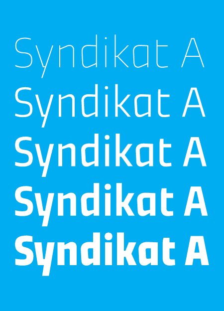
hello! i would really appreciate your feedback on this. i started with syndikat as my school project couple of years ago. it was planned to be a caps-only display typeface, but it stayed untouched on my disk for a long time. recently i decided to get back to it and i redrew all the caps and got some ideas for lowercase as well. i quickly drew these semiangular-semismooth letters and i think they work quite well. i almost completed the thin and the heavy extremes and i'd like to interpolate three styles in between. syndikat will have the standard character set of a text faces with small caps, maybe special initial caps, few set of figures and so on, but its function should be primarily display.
what do you think?
thanks, ondrej
| Attachment | Size |
|---|---|
| typophile.pdf | 44.56 KB |
