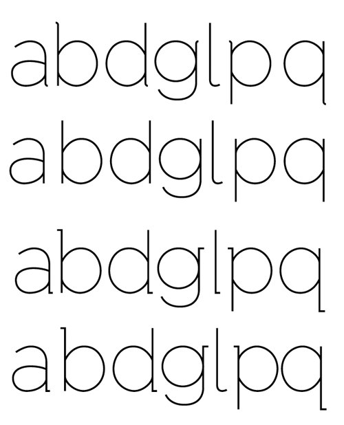
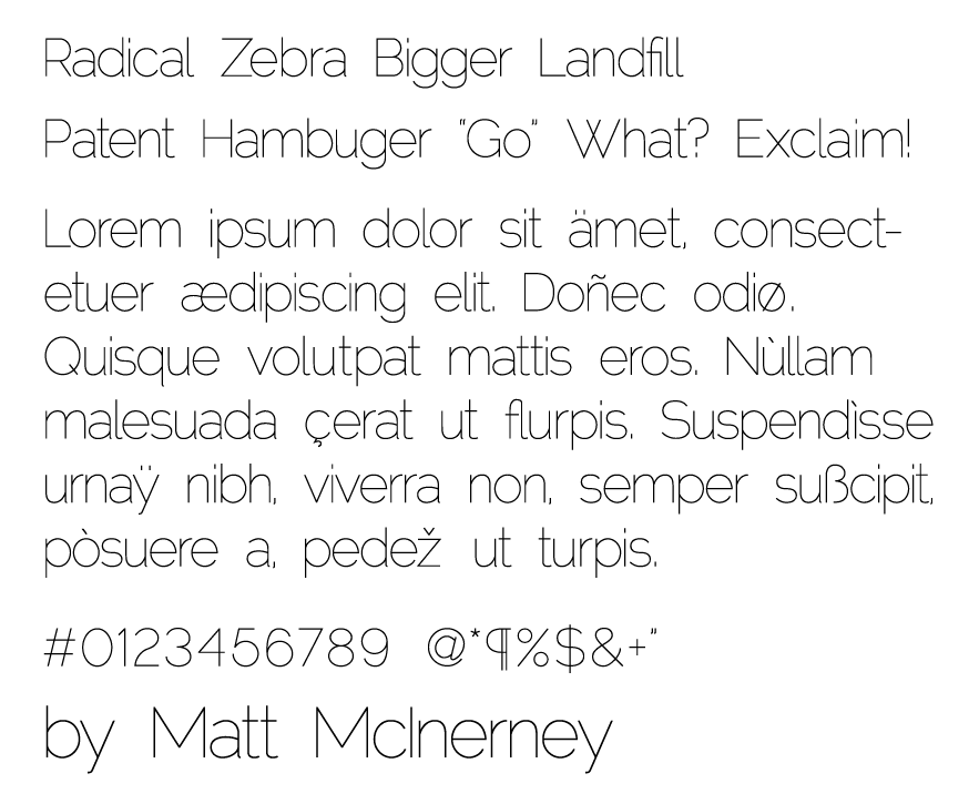
I wanted to create an elegant thin grotesque typeface for my own use and a collaborative project I'll be working on with a friend. I found some inspiration in Helvetica Ultra Light, Gotham, and Museo. I did try to combine the influences to create something with it's own unique characteristics hopefully (mostly in lowercase characters a,b,d,g,l,p,q,w).
I've noticed that some of the diacritics have rendered really poorly, but I haven't quite been able to figure out why (they are barely visible in the PDF, some not at all in the screenshot below, but they show up fine in FontLab)
I plan on expanding it to a book, bold, and black weight, I just want work out the kinks in this weight first and fix the kerning (right now I've been manually adjusting in Illustrator)
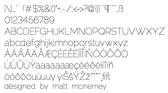
PDF version
Edit: I was able to fix my problem with the diacritics