
This is design for Ampersand for my new text font. Any comment please. Thanks.
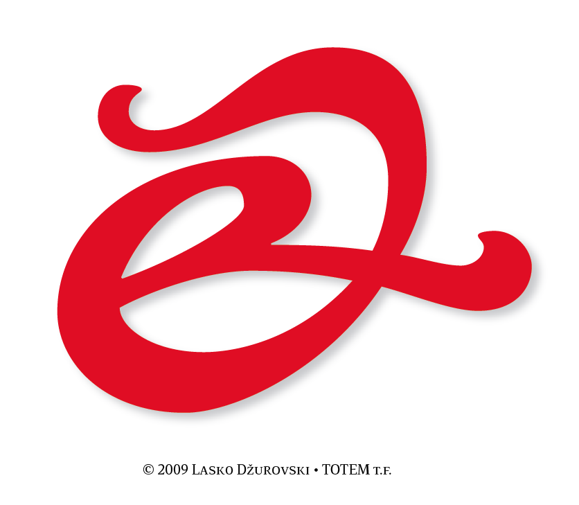
This is design for Ampersand for my new text font. Any comment please. Thanks.

What's there to comment? A great looking ampersand, I really like the swashes:)
A little sample of some letters would be great though. Something like "Pride & Prejudice", to show how it looks with other glyphs.
- Filip Łysyszyn

I'm not an ampersand expert, but it would look pretty much like an uppercase "O" when I blur my eyes a bit while viewing it.
But I agree with Lysyszyn, it's a beautiful ampersand indeed. :D
Thank you for your comment Filip. Here is the with some letters. This is BlackItalic weight. I work on other 4 weights.
Regards

Thank you for your comment Filip. Here is the with some letters. This is BlackItalic weight. I work on other 4 weights.
Regards
This is sample of light version. Thank you mk2, i send you sample of my version of uppercase O swash letter.


To my eyes, the light italic version is too closed: the upper stroke shouldn’t touch the eye of the e. Also, the curve don’t seem very smooth.
Yes, you are right Ricardo light version is too closed. Thank you i coorrect this. The Ampersand in light version is not final. It stil needs work. So thats the reason why i have put the ampersand on this forum so i can decide what is the best version.
Well, after seeing it with letters I must say that it doesn't fit like it should...
I would say that letters have a nice calligraphic, but a bit rough feeling, and ampersand misses this roughness - for me it looks like you've used "rounder corners" illustrator filter on it:)
Maybe you should try to make this ampersand's curves more like j's or e's, a bit harsh, not so rounded.
It's just what I feel, so you can really ignore what I said:)
By the way, I really, really like this font - good job!
- Filip Łysyszyn

In the first image the u and the d are not close enough together.

I agree with Filip. The ampersand on its own is rather nice, but it doesn't quite match the overall feel of the letters. The letters have a bit of a hewn look to them — not exactly rounded, but not straight either — whereas the ampersand (at least in the heavier weight) is extremely rounded and softened. Interestingly, the light version captures this feel better, though it does need more openness.
All in all though it is looking nice. I especially like the glyph with the leaf.
Captured from web.archive.org on 17 Apr 2015. view this capture