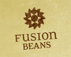
This is a logo I designed a few months back that I’m now revisiting. The mark is based on an abstracted coffee grinder, and the name refers to the idea of fusing coffees from different countries and cultures together to create unique blends. His coffee is also fantastic :)
I liked the type at the time but the “n” at the end of fusion now really bothers me, I’m leaning towards just making that top line all uppercase. The distressed look is in line with the look we’re developing for the brand, you can see the site (just launched a week or two ago) at http://www.fusionbeans.com/ We’re also going to do a letterpress business card which I’m pretty excited about.
I’d love some feedback on the mark, type, or any other thoughts/ideas. Thanks!