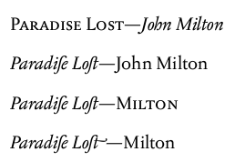
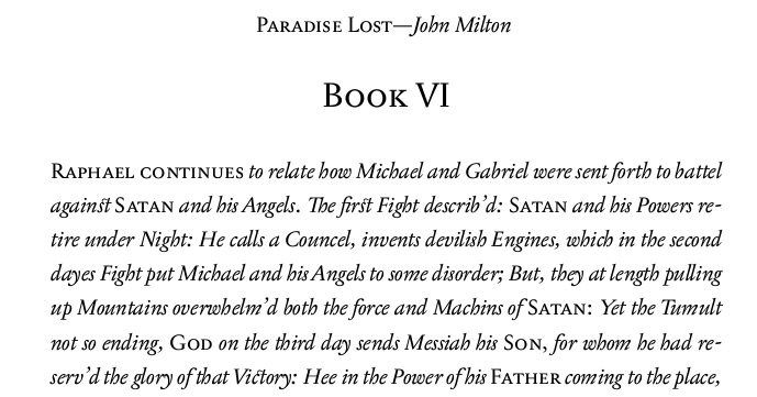
This is my first go at some book typography; a small edition of Milton’s Paradise Lost, with illustrations by William Blake. If I manage to get it together, I think I’ll try to print and hand-bind a copy, and make the PDF available free.
As most editions of Paradise Lost are either ugly paper-backs or beautiful but impractically large deluxe editions, the aim of this project is to produce an attractively designed version of the poem which is small enough to be readable. It may need to be printed in two volumes, as I think the total length will be c.400 pages. I’m for a vaguely historically informed look to it, whilst adopting modern practices which aid readability. Therefore the typeface is Storm’s Jannon, with discretionary ligatures but with short Ss (except in titles and the like).
The poem is in 12 books which comprise a short prose introduction followed by long sections of blank verse (c.800 lines). There is a Blake illustration for each book which I have inserted between the introduction and the prose. The plan is to have each Book starting on a verso, with the illustration on the facing page, so that the poetry starts on the next page.
I’ve attached the title pages and the start of Book I to this post. Any thoughts about it would be gratefully received.
Things that I’m worried about
i) the half-title page;
ii) the vertical alignment of the introduction;
iii) whether the illustration appears too low compared to the header; and
iv) whether the left-margin is too large on the poetry pages;
v) whether the pages should be reversed (i.e. with sections starting on the recto...which perhaps should have odd numbers).
Any other thoughts or criticisms would be very welcome :-)
Thanks!
| Attachment | Size |
|---|---|
| sample_of_front_matter_and_internal_pages_1 | 701.04 KB |
| sample_of_front_matter_and_internal_pages_2 | 701.49 KB |
| sample_of_front_matter_and_internal_pages_3 | 701.2 KB |