
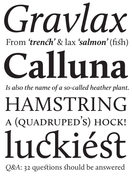
Finally after 1.5 years of not always intense labor the release of Calluna is a fact. Be sure to have a look at the PDF specimen. Hope you like it!
It's available at MyFonts.com.
| Attachment | Size |
|---|---|
| Calluna_specimen.pdf | 268.86 KB |
Finally after 1.5 years of not always intense labor the release of Calluna is a fact. Be sure to have a look at the PDF specimen. Hope you like it!
It's available at MyFonts.com.
| Attachment | Size |
|---|---|
| Calluna_specimen.pdf | 268.86 KB |

Bravo! Bravo Bravo!!!
ChrisL
:-) Thanks x3!!!
ChrisL

I am not sure which is prettier... the flower of the common heather or your font.
Michael
Edit: That is a compliment by the way : )

Excellent! Congratulations.

Wonderful!
How cool, Chris! It's soothing my type senses :P
I understand, Michael :)
Thanks, Stephen & Bill!
Forgot... if you (think you) like it, do give the free regular a spin.

And there was indeed much rejoicing. I hope you sell a million licenses, Jos.

Congratulations, Jos! I’ve had a chance to really look Calluna over, and if anyone is on the fence about buying this one, trust that it would be a bargain at triple what Jos is selling it for.

Congratulations, as well. It looks excellent. I agree with Mr. Puckett—it is a bargain.
If I could sell a million licenses I would just offer 'm for a dollar :)
Thanks, James & Steve! I'm curious if other people will think so too.

Congrats! Looks beautiful.
Thank you, Craig!

Bravo, bravo! This is looking fantastic! I'm still amazed how lovely your italic is!!

Looking great! Congratulations Jos!

Way to go, Jos!
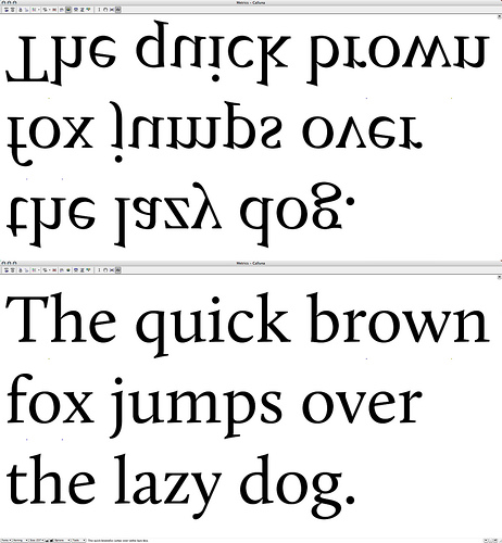
Just printed it out: the reading flow is great, don't worry about it!
Cheers!
Thanks Ben & Brian!
I didn't worry about the it, Fábio :-) It was designed to flow.
Well done!
Thanks!

Jos,
First of all, Calluna is hot like wow! Absolutely beautiful! The directional serifs work so well with the spiky serifs. And the result is not distracting at all, very easy to read.
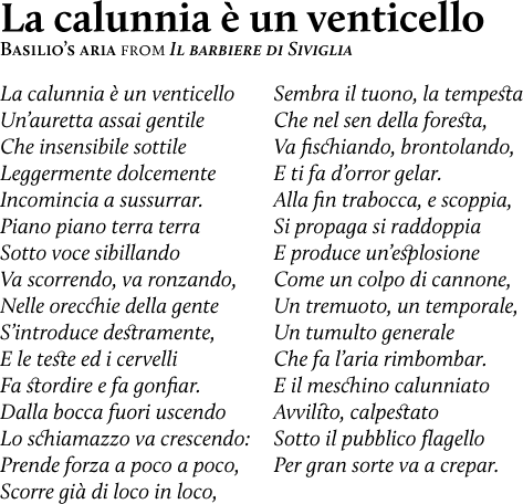
Second, the two Rumi poems in the specimen are priceless. Wonderful way to show off Calluna's love for poetry. And not just any poetry, but poetry from one of the greatest poets who ever lived, East or West.
Third, your talent is unstoppable. I haven't met a typeface of yours I didn't like. Your work is worth far more than you charge for it.
Thank you for pouring more beauty into our lives.
Rahim

Very well crafted. Congratulations!
Rahim, thank you for your overwhelming compliments! Fortunately I can pass some credit to James [Pucket] whose suggestion it was to encorporate the poems from Rumi (& Dickens) in my specimen.
Thanks, Satya!

Jos, this is another beauty of yours. Straight to the shopping list!
Thanks, Mili.
Mili,
I highly recommend it! It does great multiple umlauts :-)
ChrisL
Excellent work. Flow, to my untutored eye, is fine.
Banging on Myfonts door right now.
Thanks for you efforts.
John

Wonderful! Must find a project to justify snagging this one!
That's nice, Chris! Curious what Mili thinks about the Finish umlauts. They have the same height and size as the dot on i.
Very welcome, John.
Thanks, Darrel. Hope something will come along.
That is why I was joking with Mili, Jos :-)
ChrisL
About umlauts, my first impression on the MyFonts sample page was that they were a touch high. After downloading the regular for sample purposes I compared it with some other serif fonts and changed my mind. I like the size of them and I think they sit very nicely, better than most, the sameness with the i dot is good in my opinion.

This weird sentence means "My aim at Easter is to eat mämmi in Töölö day and night". Mämmi is an Easter dish and Töölö part of Helsinki.
Thanks for the lovely sample, Mili. And for your opinion. Never saw that many umlauts in one sentence :)
@ Chris: Thought so. But too late :)
That's a really nice serif. I like the overall smooth feel. :)
Will you make italics for the Light and Black weights?
Goed gedaan en ga zo door! :)
Kind regards,
Martijn van Berkel
Think not, but I'm not 100% sure. Maybe if there is a big enough demand.
Dank voor de vriendelijke complimenten!
The famous Mämmi which people love :-)
Thanks for sending umlaut heaven words, Mili!
ChrisL

Thats a nice roman you have there Jos. Beautiful work!
Nice one Jos! Loving italics, ligatures.
Great Work! I really love the serif. Congratulations.

excellent.
it's beautiful.
I see that Calluna is already up to number 6 on the "Hot new fonts" list on MyFonts! Congrats on a well-deserved success!
ChrisL
Thanks all. Very much appreciated!
@Chris — I noticed this morning :) Thx!

sweet!
Thank you, Mike!
Calluna just reached number 2 on the "Hot New Fonts" list at MyFonts after only a few short days on the market!
http://new.myfonts.com/hotnewfonts/
Being number 2 makes you try harder so I expect the number one status will be achieved in just a few more days!
Go for it, Jos!
ChrisL
The #1 on the hot list is also #4 on the bestsellers. Calluna is no Museo, Chris :)
But the #1 is nothing special. I don't see what the market sees in it.
Oh well, we labor for the love of what we do.
ChrisL
If we were to strand on a desert island we probably would spend a considerable time drawing letters in the sand. (After we did HELP).
We would at least do HELP in CE and smallcaps :-)
ChrisL
I can imagine you two drawing and redrawing the HELP over and over again, get the kerning right…
and then the wind would blow it away :-)
ChrisL
That's fantastic, LOI
Touchć

Wow, I missed it! Big congrats, Jos – what an interesting, complex and refined design this has become. I'm looking forward to playing around with it. :-)
One of the best and beautiful typefaces I've ever seen! Keep it up!
and then the wind would blow it away :-)
We would just go on till nature would approve of it :)
Nina, while you were enjoying a well-deserved magical Armenian trip, I worked round the clock to get it released, so it would be ready before you came home :)
Thank you, Danny.
I go off to the beach for a few days and when I come back, I see that Calluna has taken the number one spot on the MyFonts Hot New Fonts list! Way to go, Jos!
ChrisL
Congrats! :)
Thanks, guys!
Chris, you should go to the beach more often! Sure helps :)
BTW Calluna is now used for the sponsored nameplate at typographica.org.
Jos, I don't want to get too much sand on your fonts :-)
ChrisL
Dear Mr. Sandman, I *do* appreciate the constructive grinding down of occasional rough edges you do so well!
LOL!!!
ChrisL
:-)
Today, my letterpress business cards have arrived. I've designed them as little Calluna type specimens --> Click to see.
They look terrific! I hope to see one arrive in the mail soon?
ChrisL
Sure! Just e-mail me your address and I'll send you a couple in return.

This is a wonderful font, probably one of the most beautiful text fonts I've seen, beautiful enough to be a reason to register here for this comment. ;)
It is not too far away from the caption/face (german: Schriftbild), of Times in a way. It follows the x-height and letter shape, but is rounder where needed, like with the c, u and o, and overall wider, which is nice :) . Plus it is of course less "modern" in the sense of the horizontal and vertical "broadness" of the letters (sorry not an expert, don't know the term), but looks of course fresher with the twist you put on it with the upwards inclined lines to create the flow, and leaving aside the drops and things that would make it look to classic. Not sure if your "inclined direction" is the reason why it flows, but it works overall perfectly.
In a way it achieves what Gentium and Lido don't achieve, to be a Times with a human touch and look good with it. Lido looks like a Comic font too me ;) well a bit.
Sorry for the comparison to Times, but I mean it in a good way ;) cause Times is a good font, but it is obviously born long time ago, it is just too modern, too narrow, too traditional. To me, Calluna is a great font of its own. :)
Captured from web.archive.org on 14 Oct 2013. view this capture
