Typophile

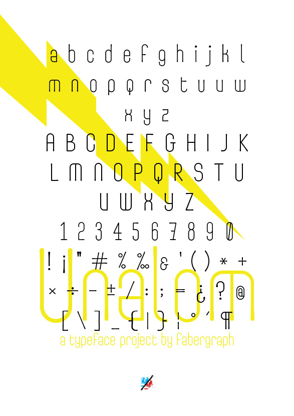
Unalom - wip

Béla Frank

Dear Typophiles!

While pushing other projects I take a break and playing around with this little sans project - reminds me like kinda typewriter style with those slightly broadening, curly terminals.

No boning effect was removed yet.

What do you think of it? Do you like it/hate it? Is it boring or not so?

Thanks for your comment and critique in advance!

fab
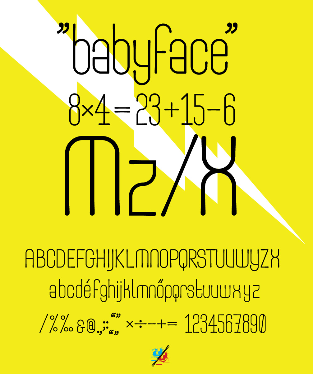
Not so boring, IMHO. But a bit too thin to be used as a text face, as most 'typewriter' font capable of.

PS: Excuse my bad english.

Thanks mk2!

Actually you're right - the project wasn't supposed to be set in extremely small size.
However, first print test shows it is quite legible set is as small as 6-8 point.

An update: more complete character set, some test (you could check pdf).

http://www.fabergraph.hu/faberfonts/specimen/unalom_specimen_01.pdf

Would be nice to have some c&c. Thanks!

It'd make a nice magazine cover typeface I think. I wouldn't bother so much about not being legible at small sizes. You might want to make it look amazing really big. The roundish, dropish terminal lends itself well for that.

As far as shapes go, I'd check on the shapes of lowercase A, F (maybe the terminal not so geometrical half circle), R (same as f), S (s being the one I enjoyed the least - pretty hard to get right - spine might not make such steep directional change). Observe what you did with J lowercase, I think r, f should match that, looks good.

The lower part of uppercase B seems a little too far to the left.
In the numbers, you may try to review 7, for one without the bar on the center.

Cheers!
Rodrigo Saiani

This is a good original concept.

Overhanging top of & puts it off balance. A leg on the right could compensate for this.
Top of s is too closed.
# is comparatively very wide.

Thanks for comments and some work :) finally Unalom was released here:

http://new.myfonts.com/fonts/faberfonts/fr-unalom/

Captured from web.archive.org on 14 Apr 2015. view this capture