
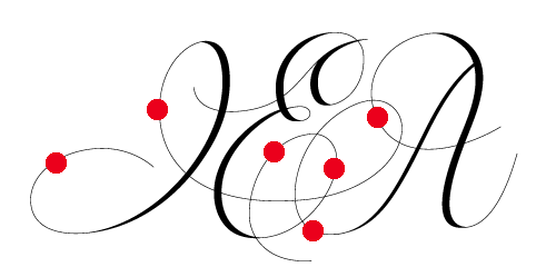
Monograms are not something I'm familiar with, neither this kind of delicate script style. If you have a minute, I'd love some opinions on this. The letters are I E A (Ingrid Elisabet & Anders). I'll spell the names out underneath.

Monograms are not something I'm familiar with, neither this kind of delicate script style. If you have a minute, I'd love some opinions on this. The letters are I E A (Ingrid Elisabet & Anders). I'll spell the names out underneath.

The letter “I” it’s always a tricky one. The risk I see here is that it may end up visually as an ornament of the “E” instead of a separate letter.
I would also check the first stroke of the “A”, which don’t get along with the others...
That said, I wouldn’t be able to come up with something so good! :-)

I was confused by the relative closeness of I and E. I first tried to read them as a single letter (N?). It seems strange that I and A run together while the E is unconnected with either.

I apologize if this come across as too heavy but these pattens of heavy & light don't make sense to me even in a mannerist model. The left side of the a in particular seems like a compromise not a definite act. Also if you are going to be mannerist think about what you want to emphasize and why. Being mannerist is a license - use it. The second smaller heavy part of the E for instance - why is it compteting with the identity of the E? I would think about it & do it again.
It's not at all heavy, Eben. I find these kind of things hard to pull of. The style seems to be created with two kind of tools, one wide – one very thin. You're right about the left stroke on A. I wanted it to resemble an upstroke with a wide pen, that's why I thinned it out slightly.

I too tried to read the IE as a single character at first. After reading your post I had no problem with reading it.
In my eyes, the A needs the most work. As the horizontal stroke now looks more as an embellishment than part of the letterform.
(funnily enough I'm working on an wedding monogram myself, although in a completly different style: http://typophile.com/node/60527)
I took this in a completely different direction. Good luck with yours!

Love it. Looks pretty good.

Absolutely gorgeous. One thing I see is that the distribution of weight causes it to look like the letter spacing between the E and A is much greater than I and A.

"The style seems to be created with two kind of tools, one wide – one very thin."
This genre is done with one pen. A pointed nib. The thicks and thins are achieved with pressure and release.
If, however, you are going to draw it with a monoline thin pen and add the thicks later you must look at it as a chessboard with accompanying thoughts of what "Copperplate letters" should look like. This will mean you will have to use models of Copperplate to define the thicks/thins on chosen letters and then wing it to "fatten up" dead spots (very thin areas like the left side of the I). Does this make sense?
Just like the "Roman" the left side of the A should be thin... and to fill you could add weight to the A crossbar or the right hand flourish of the E. That should fill in the "hole."
Yes the A is too distant from the other letters and I have indicated where you might think about adding taper to equal it all out.
I've abandoned this long ago, but thank you for the comments. Michael: I'm not familiar at all with how Copperplate letters should look like, thus the amateurish appearance:) Can you point me in the direction of any good writing on the subject?
Why did you abandon it? It has potential, you could just rework with pointed pen as Michael said.
Bodoni for example is typeface based on pointed pen construction.
http://books.google.com/books?id=FiJ87ixLs0sC&pg=PA200&lpg=PA200&dq=bodo...
Frode
Look up Copperplate on youtube. There you will be able to see wonderful executions with the pointed pen. Especially with Michael Sull.
Michael
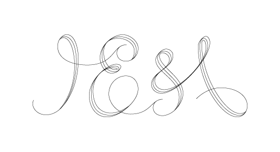
Because the wedding was saturday, and I made this instead :) I'm not satisfied, but the couple liked it.

Thanks a lot, Michael. Now I'm going to be up all night watching YouTube :-)
- Lex
Step away from the YouTube Lex and put your hands on the car : )
Michael
Captured from web.archive.org on 25 Jul 2014. view this capture